
|
Piet Mondriaan (Mondrian), Zeeland Church Tower (Church Tower at Domburg), 1911; Kunstmuseum den Haag. 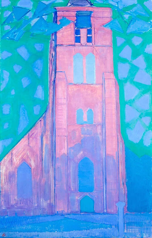 It seems such a shame to change the colors on this already beautiful image of Zeeland Church Tower by Mondriaan (Mondrian). It's hard to tell if the darker, revised version below is a recently painted copy, or if it's just a digitally altered photo. The photo above, verified by other reliable sources as well, is from the Netherlands museum where the authentic painting is located. 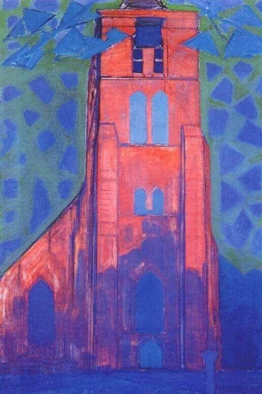 Altered version of a painting by Piet Mondriaan.  Corrections or suggestions?
0 Comments
Edgar Degas, Two Dancers on a Stage, 1874; © The Samuel Courtauld Trust, The Courtauld Gallery, London. 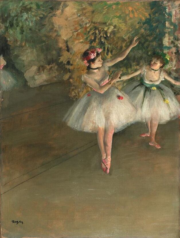 There seems to be a trend these days toward taking beautifully executed paintings and turning them yellow. I don't know why. The process covers up the detail, subtlety and expert artistry of the original painting, and gives a false impression of the artist's work overall. Possibly it's the result of photographs taken in bad light, then manipulated online. There are also images tinted in various other colors, damaging flesh tones, clouds, sky, water, and so on. One benefit: alterations like that make it easier to spot a poor copy! 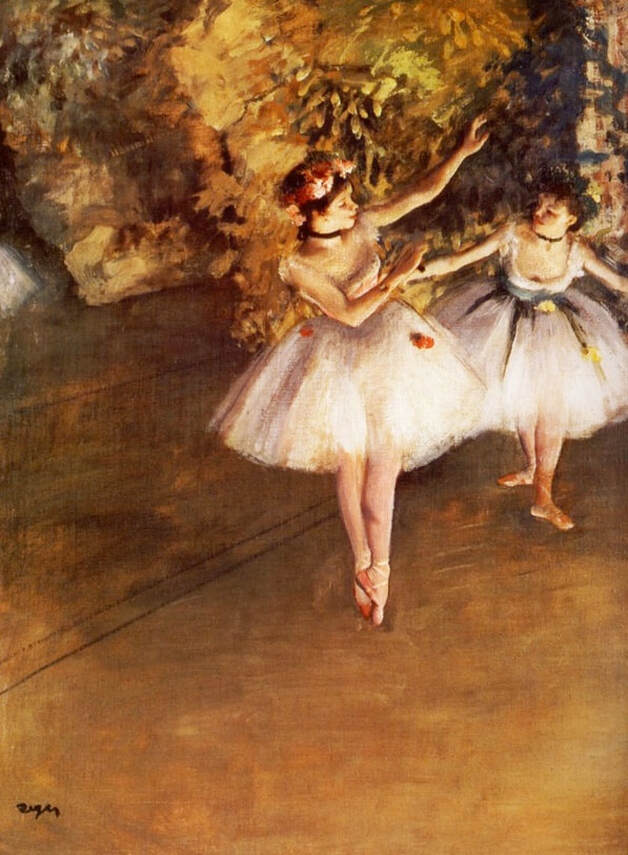 Altered version of a painting by Edgar Degas.  THE ART DETECTIVEBloopers, Fakes & Mistakes
Vincent Van Gogh, Olive Trees, 1889; Scottish National Gallery. 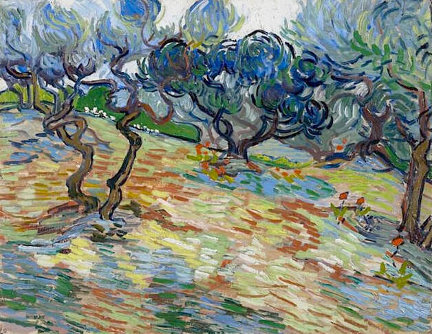 Vincent Van Gogh produced many paintings called "Olive Trees," but the all-blue reproduction below isn't one of them. It's unlikely that the blue effect — along with the other color changes — could have been achieved by photo editing alone, so the modern interpretation is mostly likely a recently produced commercial artwork, rather than a photo that's been altered by a random user. Which makes me wonder: It certainly would have been just as easy to copy the colors of the original. Why turn everything bright blue? 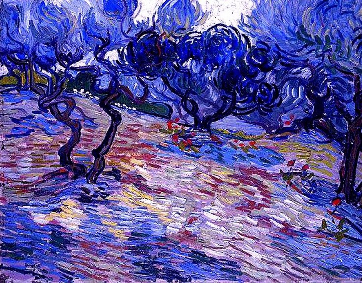 Altered version of a painting by Vincent Van Gogh,  Corrections or suggestions?
Gustav Klimt, Emilie Flöge, 1902; Wien Museum, Vienna. 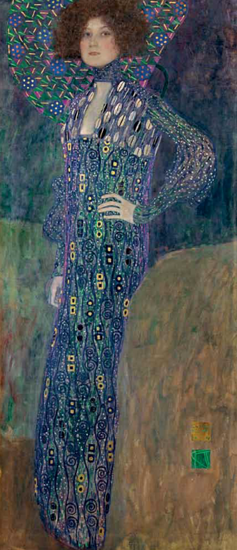 This is one of Klimt's most famous paintings, and is the star of the Klimt collection at the Wien Museum in Vienna. It's very tall, with distinctive coloring and detail. The oddly cropped, modern reproduction below, seen online in various locations, is overly blue throughout, and has obscured much of the subtle complexities of the original. It's also missing the entire bottom half of the painting — but accompanying captions don't say so. 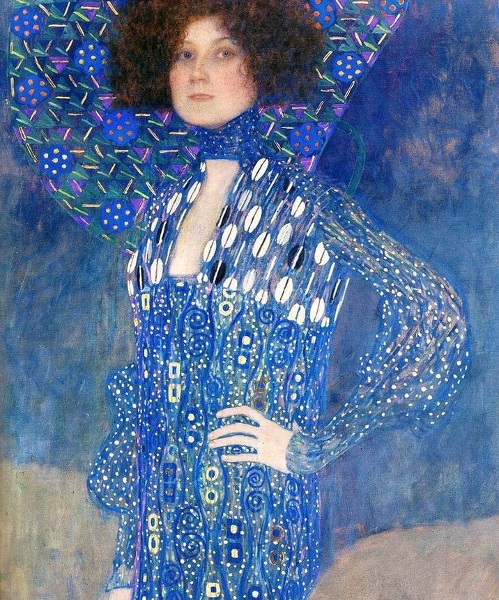 Altered and cropped version of a painting by Gustav Klimt.  THE ART DETECTIVEBloopers, Fakes & Mistakes
Nicolas de Staël, Figure on the Beach, 1952; Kunstsammlung Nordrhein Westfalen, Dusseldorf.  The artificially brightened and color-altered reproduction below has gone so far with its changes that the artist's original concepts have nearly disappeared. A visitor who viewed the painting at an exhibit at the Museum de Fundatie (Zwolle, Netherlands) stated, The first thing one notices in this painting is its robustness, and its redness. The quality of heat forces itself towards you, and it is the color red that is particularly expressive of this. The modernized version has lost all of the work's depth, intention and intensity.  Altered version of a painting by Nicolas de Staël. Henri de Toulouse-Lautrec, Moulin de la Galette, 1889; Art Institute of Chicago. 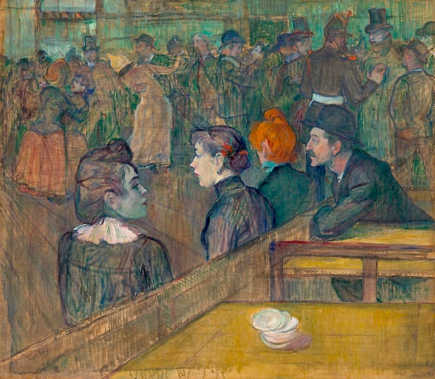 "With this painting of the dance hall known as the Moulin de la Galette, Henri de Toulouse-Lautrec established his reputation as the painter-chronicler of the entertainments of Monmartre." That's how the Art Institute of Chicago opens its note about this famous artwork, revealing the painting's importance in culture and history. It's sad to see the poorly altered version below appearing in various locations online. The extreme contrast, along with the unnatural yellowed and intensified color, remove much of the detail, and draw the eye away from, rather than toward, the subtleties of the action taking place. For example: Lautrec employed the wood barrier as a metaphorical divide between the frenzied action of the dance hall, seen as a blur in the background, and the stillness of the bored and waiting women (accompanied by a proprietary male) in the foreground. The dimness and shadows are part of the story told by the picture: Lautrec used serpentine to thin his paint and applied it in loose washes, a technique known as peinture à l'essence. The result is a seemingly unfinished look that suggests both the immediacy of the artist's observations and the dinginess of his subject. By brightening the scene, adding more clarity and sharpness to the images, and erasing a sense of depth and distance, the reproduction has lost nearly everything intended by the artist. 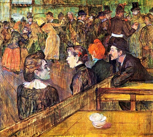 Altered version of a painting by Henri de Toulouse-Lautrec.  Corrections or suggestions?
Édouard Manet, Roses in a Champagne Glass, 1882; The Burrell Collection. 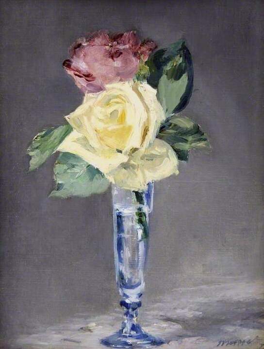 The severely altered image below could be the result of a digital edit, but it's more likely a recently painted reproduction, with highly imaginative coloring. The Burrell photo is consistent with Manet's other still life paintings, and is more textured, more interesting. Burrell mentions that "Manet was ill for the last two years of his life and gave this painting to a friend as a thank you for bringing him gifts of flowers and sweets." 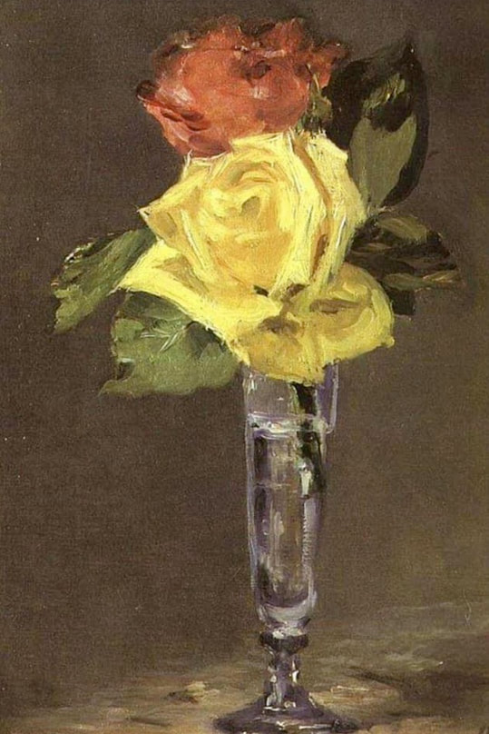 Altered version of a painting by Édouard Manet. Camille Pissarro, "Red Roofs, Corner of a Village, Winter," 1877; © RMN-Grand Palais (Musée d'Orsay) / Jean-Gilles Berizzi. 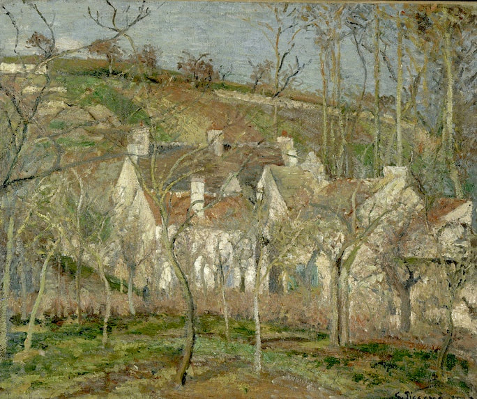 I think we can rule out a simple photo edit in this case. The brightly colored image below is almost certainly a recently painted reproduction. Modern interpretations are fine if you like them. But it would be helpful if art vendors would mark their fresh creations clearly, so that viewers know to go elsewhere for a more accurate image. 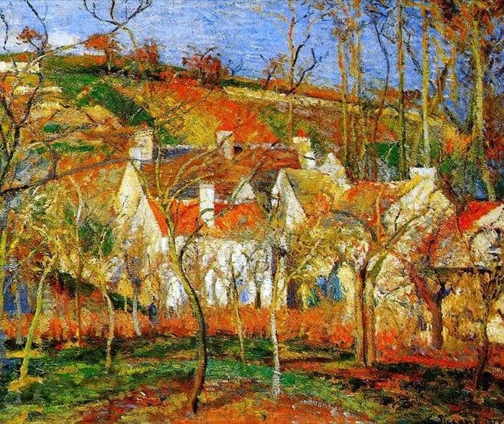 Altered version of a painting by Camille Pissarro. Paul Klee, Ad Parnassum, 1932; Museum of Fine Arts Bern. 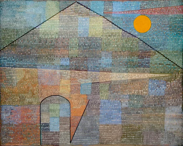 This magnificent painting by Paul Klee was the featured work in a 2008 exhibition at the Zentrum Paul Klee, and is explored in detail in a 2012 video produced by the Museum of Fine Arts Bern. The painting is considered so valuable that before the museum shipped it to Zentrum Paul Klee for the exhibition, they did a test run with a different painting, to judge how much stress the painting would be subjected to during the journey. The photo above was taken from the museum's video. The altered version below, which changed all the colors for some reason, is probably a modern reproduction. It's been widely accepted as an official image despite its inaccuracies, possibly due to the fact that the museum's image is less easily accessible. 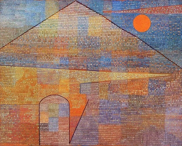 Altered version of a painting by Paul Klee.  THE ART DETECTIVEBloopers, Fakes & Mistakes
Edward Hopper, New York Restaurant, 1922; Muskegon Museum of Art. 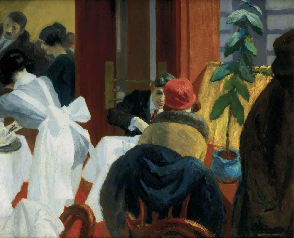 The reproduction below, possibly an amateur photo that was further edited, has taken a work that's full of rich color and turned it into a flat, monocrome image, obscuring much of the original pigment and detail. The real-world painting contains bold tones in Hopper's signature style, and is also very sophisticated in its use of light and shadow, depth, and contrast. The new version doesn't have any of these qualities. 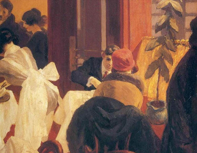 Altered version of a painting by Edward Hopper.  Corrections or Suggestions?
|
REAL or REPRO?
A well-researched art resource that can help you find accurate images and spot altered copies. 100+ listings and growing daily. Browse at random, or search for something specific. Special requests are welcome.
Categories
All
Archives
January 2021
Disclaimer: This blog is intended for entertainment purposes only. Although every effort has been made to verify the accuracy of the information provided, the material included here should in no way be considered the final authority on any issues discussed in the text.
|
 RSS Feed