
|
Vasily Kandinsky, Upward, 1929; © Peggy Guggenheim Collection, Venice. 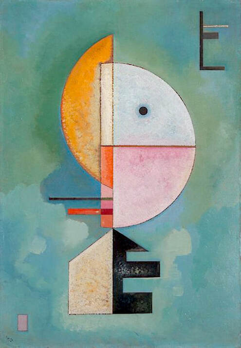 There isn't a big difference here, but the altered version below does reflect changes in coloration. The work could easily be mistaken for a Klee, and collection notes mention the similarities. They also provide some additional details: A linear design in the upper right corner [...] echoes the vertical thrust of the central motif. This configuration resembles the letter E, as does the black cutout shape at the base of the central motif. These forms may at once be independent designs and playful references to the first letter of "Empor," the German title of the painting. 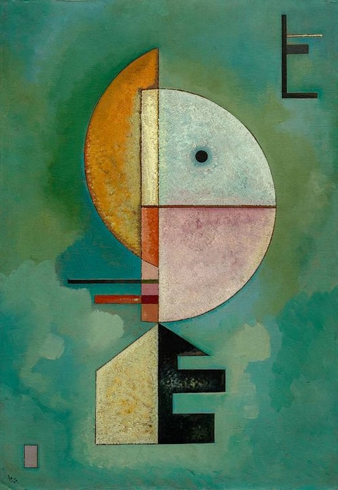 Altered version of a painting by Vasily Kandinsky.
2 Comments
Georges Braque, Landscape at La Ciotat, 1907; © Artists Rights Society (ARS), New York / ADAGP, Paris; Museum of Modern Art (MoMA), New York. 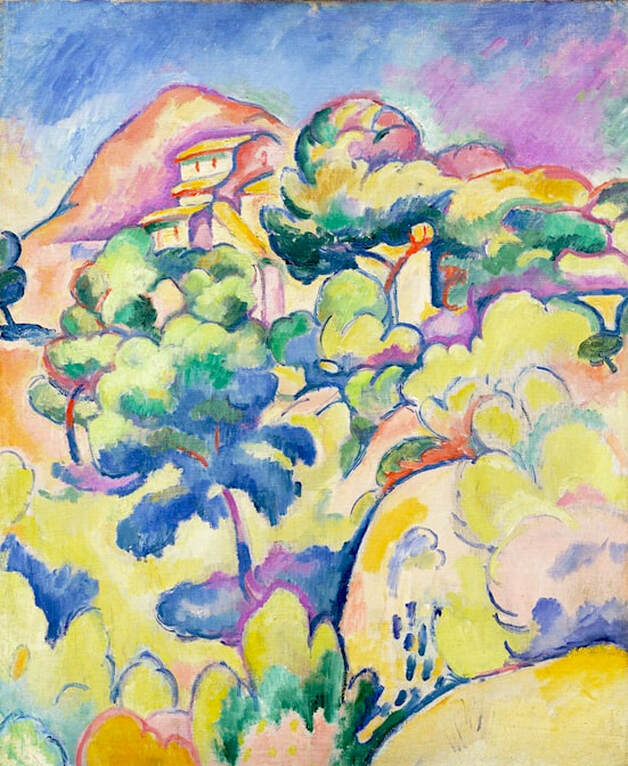 In this unusually reverse case, the oddly muted reproduction of this Braque painting looks darker and less colorful than the original. It's well known that early in his career, Braque identified with the Fauves and favored bright colors in his artwork. Landscape at La Ciotat, as seen above, is a good example. Unfortunately, the dark, brownish copy below is often seen instead, despite the fact that it barely looks like the same painting. Apart from completely altering the palette, the new version has taken the life out of the work, and obscured a lot of the interesting and lively detail. The museum notes: Before Braque met Pablo Picasso [...] he painted in the bright, bold colors shared by the Fauves. [...] They were given this name — meaning "wild beasts" — by an unsympathetic critic in 1905, as a result of the high-pitched colors and anti-naturalistic rendering they embraced. In the summer of 1907 Braque worked in the resort town of La Ciotat, near Marseilles, where he painted this landscape using heavy outlines, flattened space, and intense, harmonic colors. 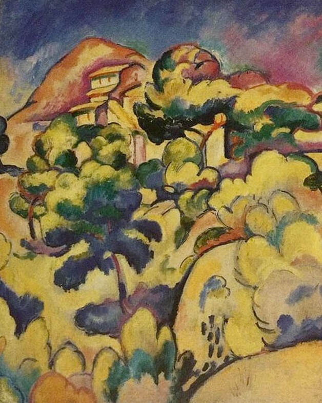 Altered version of a painting by Georges Braque. Piet Mondriaan (Mondrian), Arum Lilies, 1910; Kunstmuseum den Haag. 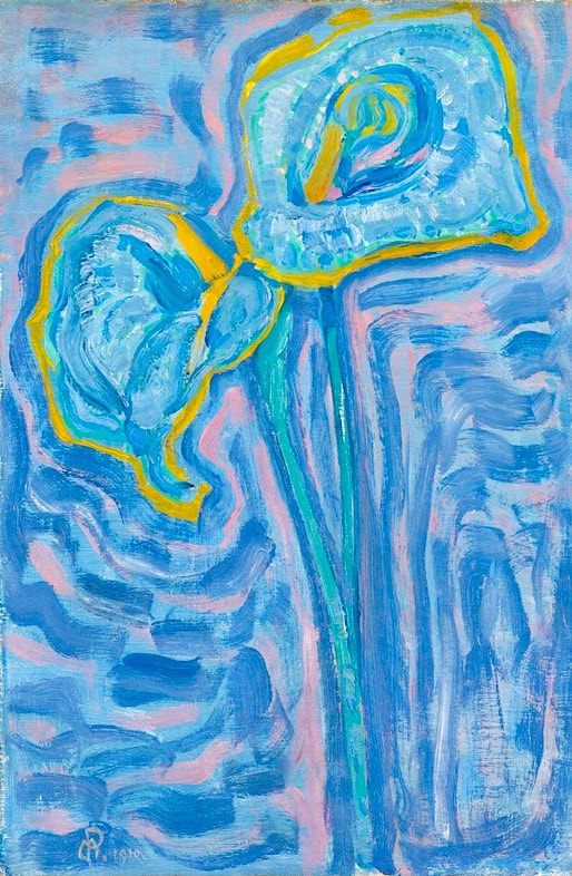 The artwork below is obviously a modern reproduction that has randomly changed all the colors in this famous Mondriaan, one of the artist's popular depictions of arum lilies (aäronskelken). A first-hand photo is easily available at the museum's website, yet the purple-tinted version is seen frequently — in fact, more often than the original. There doesn't really appear to be a reason for the revisions, so it's unclear why the changes were made. It would have been just as easy to duplicate the authentic coloring. 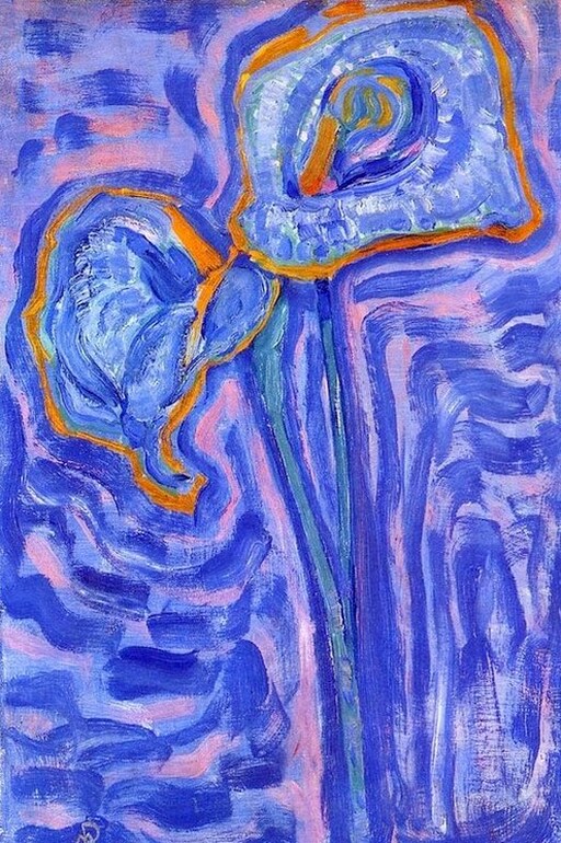 Altered version of a painting by Piet Mondriaan. Gino Severini, "Dancer = Propeller = Sea," 1915; © Artists Rights Society (ARS), New York; The Metropolitan Museum of Art, New York. 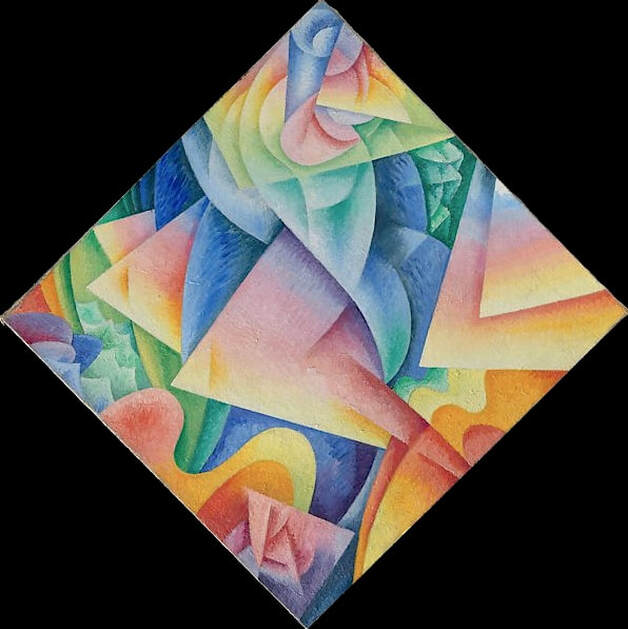 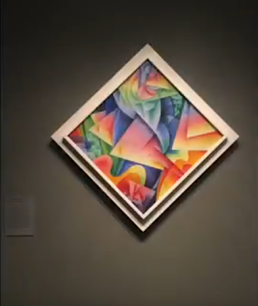 The Met points out that this Severini painting, completed just after the artist produced his manifesto, Plastic Analogies of Dynamism, is in the rare form of a diamond, "the only example [of this shape] in Severini's oeuvre." The photo of the painting on display is from a video created by a museum visitor in 2017. Oddly, many copies have been circulating with the image mistakenly rotated to make a standard rectangle, as seen below. The museum adds some background information: Like other artists associated with Italian Futurism, Severini was fascinated by the interactions of movement and matter and the dynamic speeds of the modern world. In his manifesto [...] he describes the sensory and visual "analogies" that resonate across seemingly unrelated objects, from a dancing girl to a rushing express train to abstract forms. 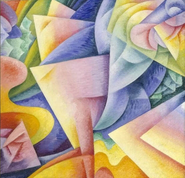 Wrongly presented version of a diamond-shaped painting by Gino Severini. Some copies of Propeller have also stated, in error, that the painting was formerly called "Sea = Dancer." In fact,"Sea = Dancer" is an entirely different work, created a year earlier, in 1914. The painting is currently located at the Guggenheim. 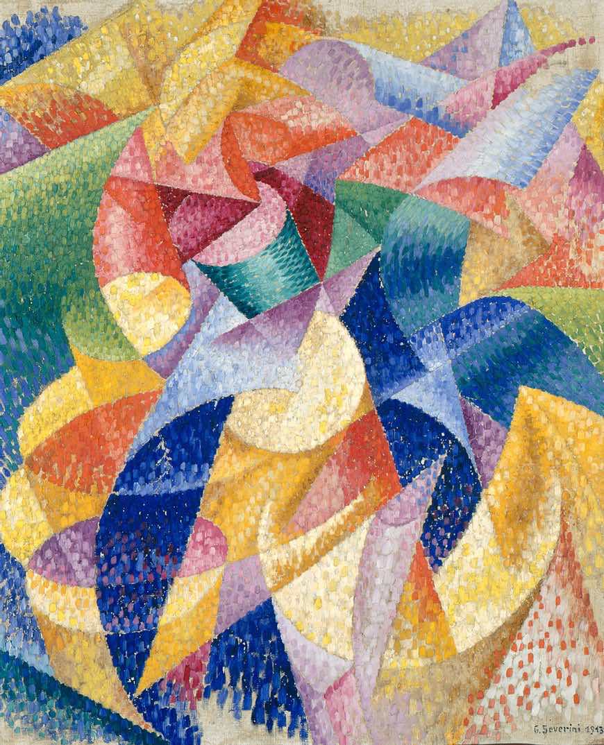 Gino Severini, "Sea = Dancer," 1914; Solomon R. Guggenheim Museum. Man Ray, Symphony Orchestra, 1916; Albright-Knox Gallery, New York.  The clear and accurate photo above, from the museum where this Man Ray painting is located, is easily accessible, yet the color-altered version below is seen frequently as a substitute. For example, there's a lot of added red that's turned the white areas pink and many brown areas reddish-orange. And there are other color changes throughout. These manipulations have skewed the work's overall appearance, for the most part by introducing hues that weren't intended by the artist himself. It's likely that this is a low-resolution photo of a modern reproduction, with some extra digital editing.  Altered version of a painting by Man Ray. Giacomo Balla, The Spell is Broken, c.1922; location unknown. 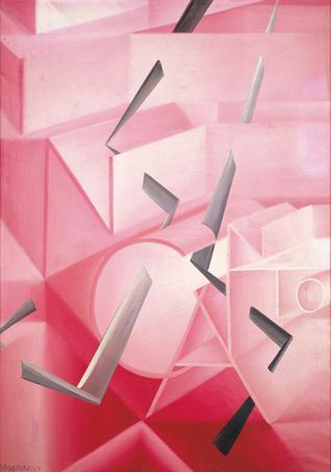 It's very difficult to find a high-resolution photo that accurately depicts this work by Giacomo Balla, and it's rarely been seen in public. The brightened, neon-colored reproduction shown at the bottom of this page is the most commonly used version, but it's clearly an altered, reimagined interpretation. The accuracy of the image above — actually a modern copy — is verified by a 2014 article about a Futurist exhibit at the Guggenheim (their photo was too small to be useful here), and is also confirmed by text from a black and white catalog of Futurist works: "The color tones range from white to pale pink, and to a brilliant shocking pink." The popular altered copy below, which doesn't contain any white or pale pink, doesn't match the description. If a good first-hand photo isn't available for a particular artwork, the second best option is to find a reproduction that reflects known facts — or as here, a small, confirmed snapshot — as closely as possible. 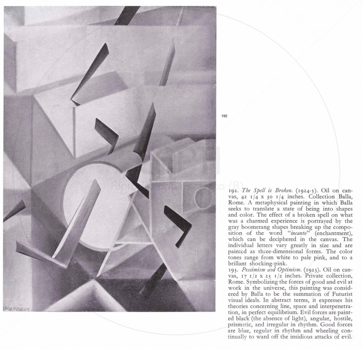 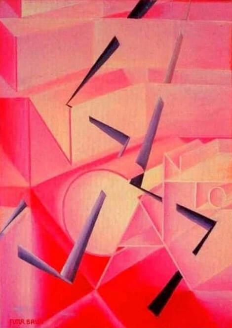 Altered version of a painting by Giacomo Balla. Vasily Kandinsky, Decisive Rose, 1932; © Artists Rights Society (ARS), New York / ADAGP, Paris; Solomon R. Guggenheim Museum. 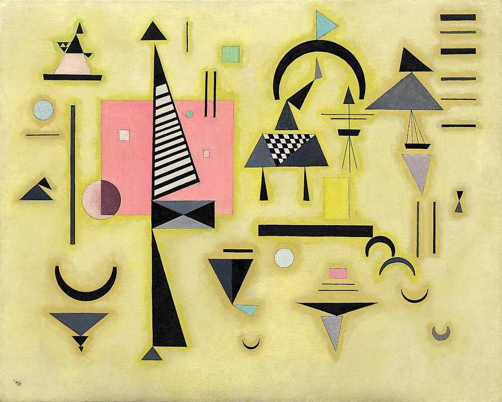 An interesting 1932 painting by Wassily (Vasily) Kandinsky, located at the Guggenheim. The title, Decisive Rose ( Entscheidendes rosa) is sometimes rendered incorrectly as Decision Pink. The altered version below is probably the result of a digital edit, which has blotted out some of the detail and added a bright yellow cast that isn't evident in the original. Not too much of a difference, but in general, if a questionable post offers a location, and the website is easily accessed, it's worth taking a moment to grab a first-hand photo. 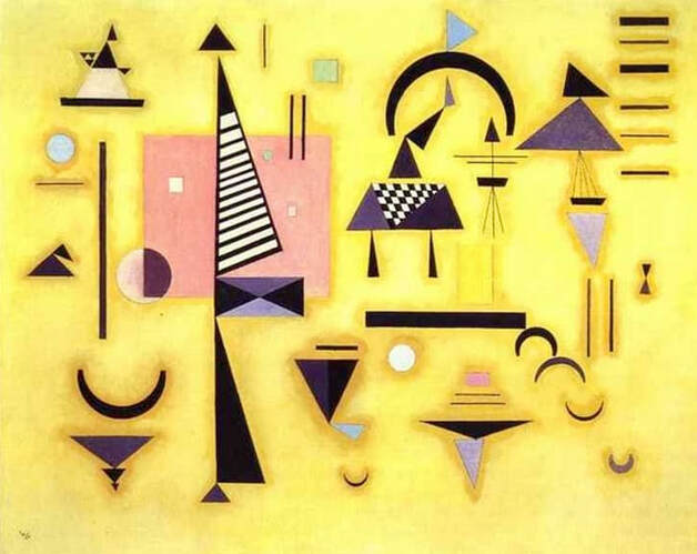 Altered version of a painting by Kandinsky. Natalie Goncharova, "The Orange Vendor," 1916; © VIG Bild-Kunst, Bonn; photo: Rheinisches Bildarchiv Köln; Museum Ludwig, Cologne. 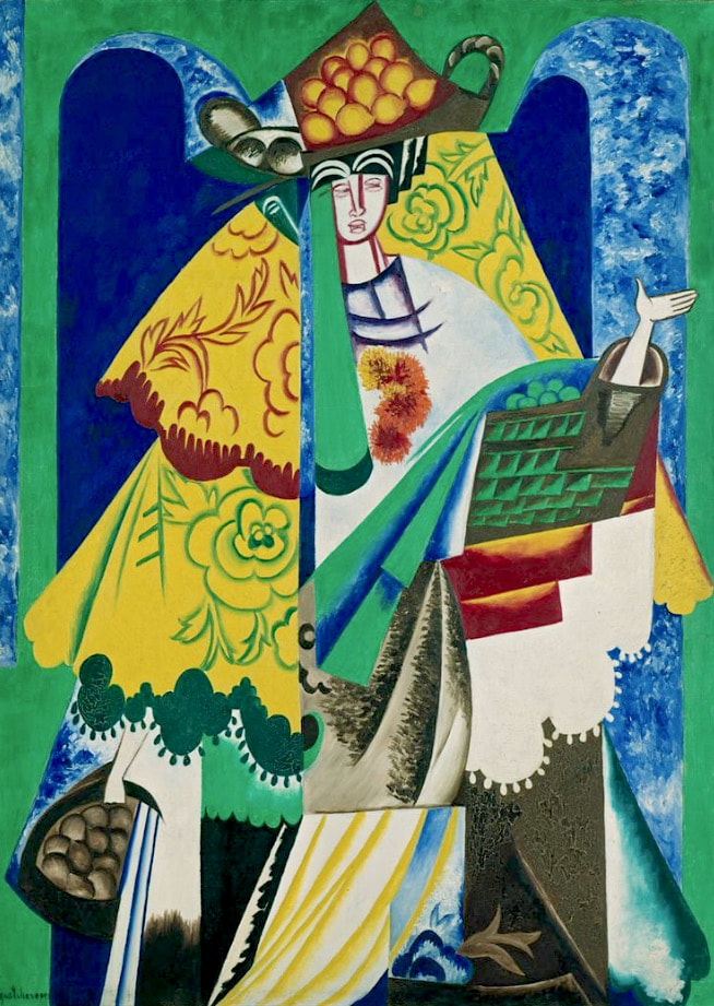 Although the reproduction shown below of The Orange Vendor by Natalie Goncharova (Natalja Gontscharowa) is clearly altered in significant ways, it's often seen online without any indication that it's a modern, revised copy. The color changes seem to be fairly random, with only passing reference to the original. There's also been excessive digital processing that has resulted in significant loss of detail. Modern copyists often trade accuracy for brightness and intensity, but efforts to appeal to modern tastes don't necessarily produce a more appealing picture. 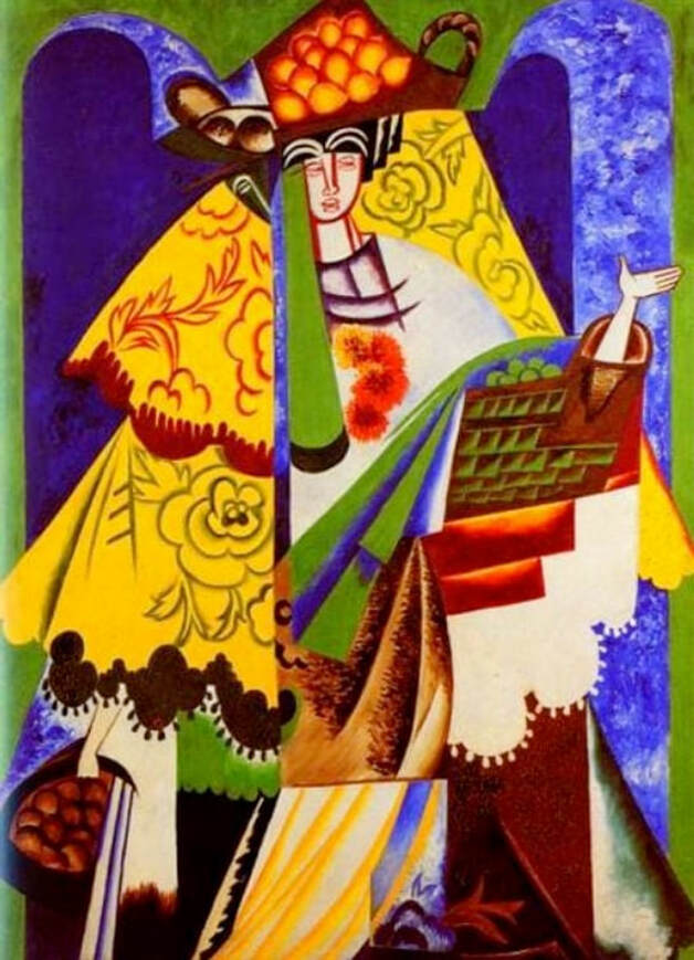 Altered version of a painting by Natalie Goncharova.  Corrections or suggestions?
Yves Tanguy, "Through Birds, Through Fire But Not Through Glass," 1943; © Estate of Yves Tangy / Artists Rights Society (ARS), New York; Minneapolis Institute of Art. 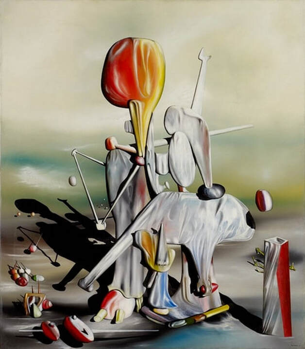 This impressive Tanguy painting, full of life, depth, resonance and power, has been turned conspicuously green in the altered version below, thus changing the overall appearance of the work and ultimately reducing its impact. Note the clean whites in the original, hints of white clouds and blue sky, with various primary colors imposed on a naturalistically hued landscape. It's helpful to keep in mind that abstractions which allude to real-world objects or settings often retain many aspects of the natural scenes they're depicting, despite their otherwise non-realistic, personalized depictions of reality. And images that look as though a colored filter has been applied — in this case, a yellow overlay — are usually revised copies that aren't necessarily faithful to the authentic work. Note: The museum listing prohibits downloads, which might be one reason why altered versions appear online instead. Their photo is shown here solely for the purposes of comparison and education. 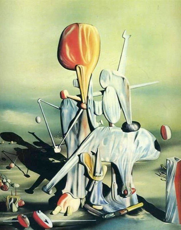 Altered version of a painting by Yves Tanguy. Henri Matisse, The Red Studio, 1911; ©Succession H. Matisse / Artists Rights Society (ARS), New York; Museum of Modern Art (MoMA), New York 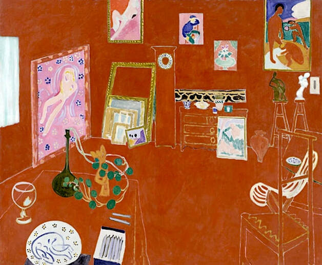 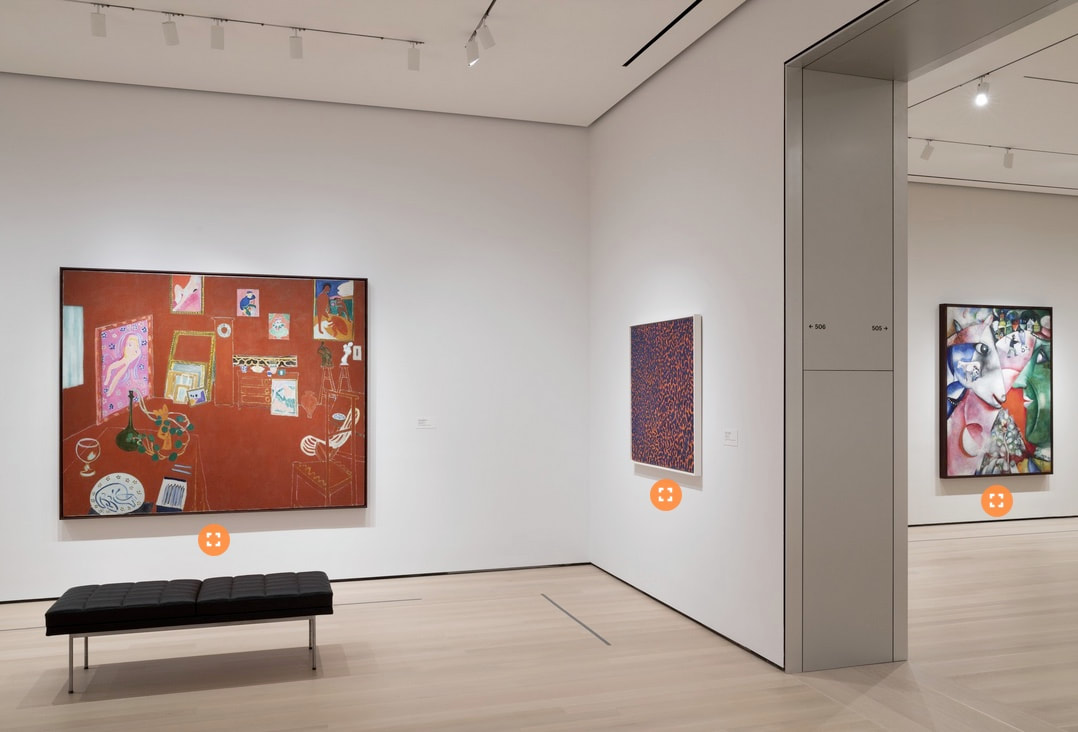 This is an unusual reversal. Despite its title, "The Red Studio" by Matisse actually looks a bit brownish in real life. The photo above shows the painting on display at the Museum of Modern Art in New York. Toward the right, you can see a colorful Chagall, which tells us that the sienna tones of the Matisse are probably accurate. The altered version below — probably an enhanced photo — has brightened and intensified everything, most likely in a wrong attempt to introduce the bright primary hues that most people associate with Matisse. 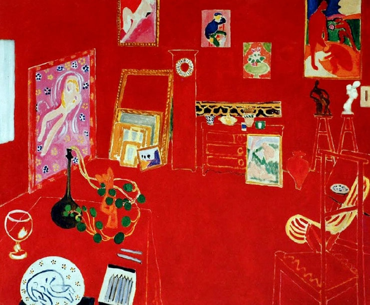 Altered version of a painting by Henri Matisse.  Corrections or suggestions?
|
REAL or REPRO?
A well-researched art resource that can help you find accurate images and spot altered copies. 100+ listings and growing daily. Browse at random, or search for something specific. Special requests are welcome.
Categories
All
Archives
January 2021
Disclaimer: This blog is intended for entertainment purposes only. Although every effort has been made to verify the accuracy of the information provided, the material included here should in no way be considered the final authority on any issues discussed in the text.
|
 RSS Feed