|
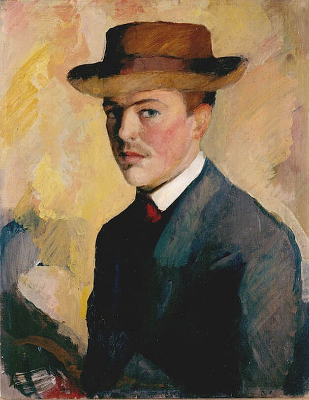
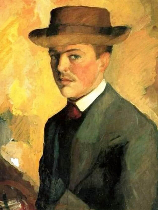
August Macke, Self-Portrait With Hat, 1909; Kunstmuseum Bonn. Modern portraiture, even when somewhat abstract in composition, tends to retain many naturalistic traits, such as flesh coloring, arrangement of facial features, and so on. A tinted appearance in a portrait, such as the yellowish overtones in the altered Macke image below, usually indicates a poor copy — either a digitally altered image or an inferior onsite photo. The picture above, from the Kunstmuseum Bonn, provides a better look at Macke's Self-Portrait With Hat, retaining much more of the detail, depth, variation and emotion of the original.
1 Comment
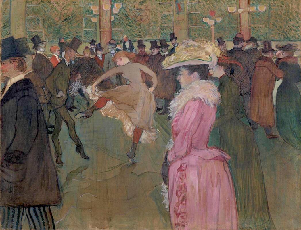
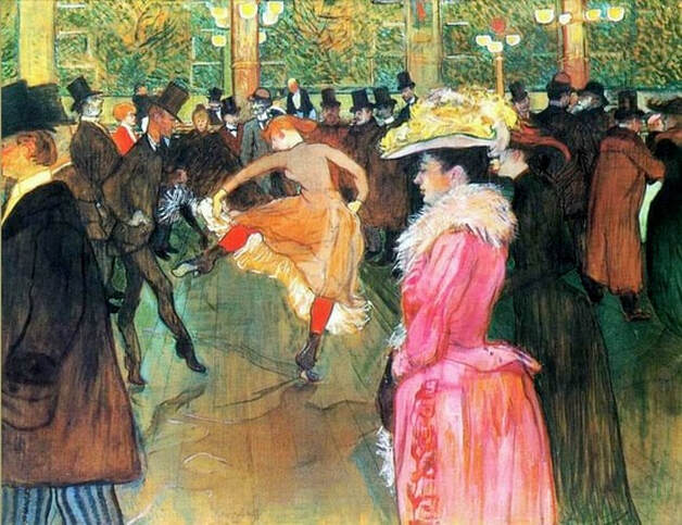
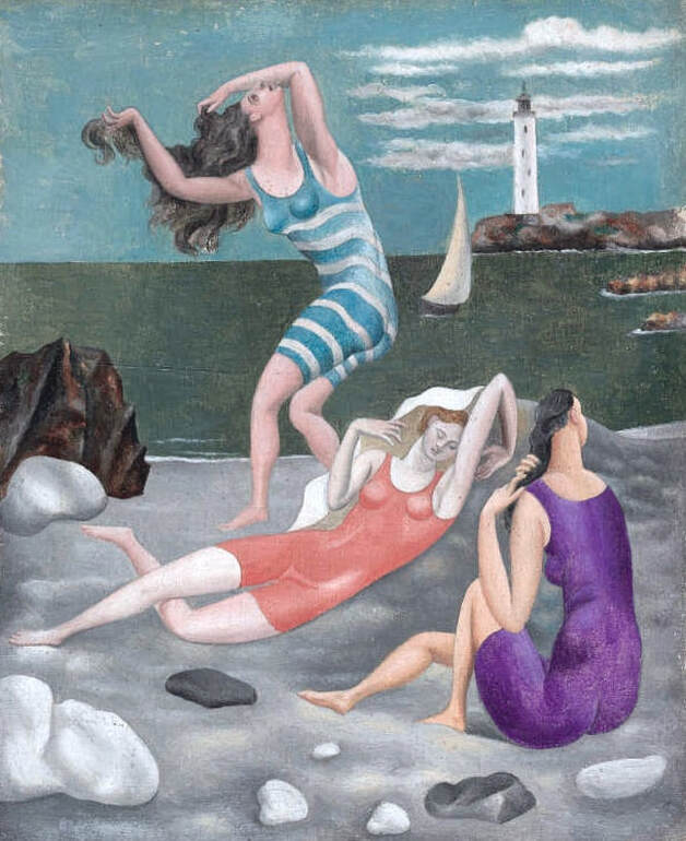
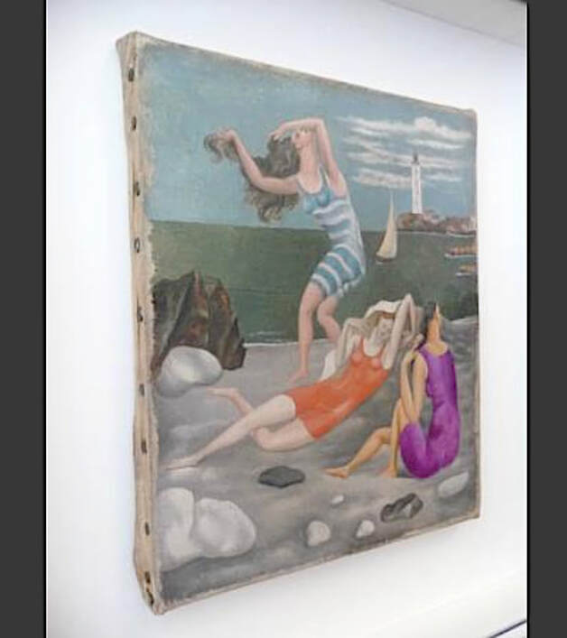
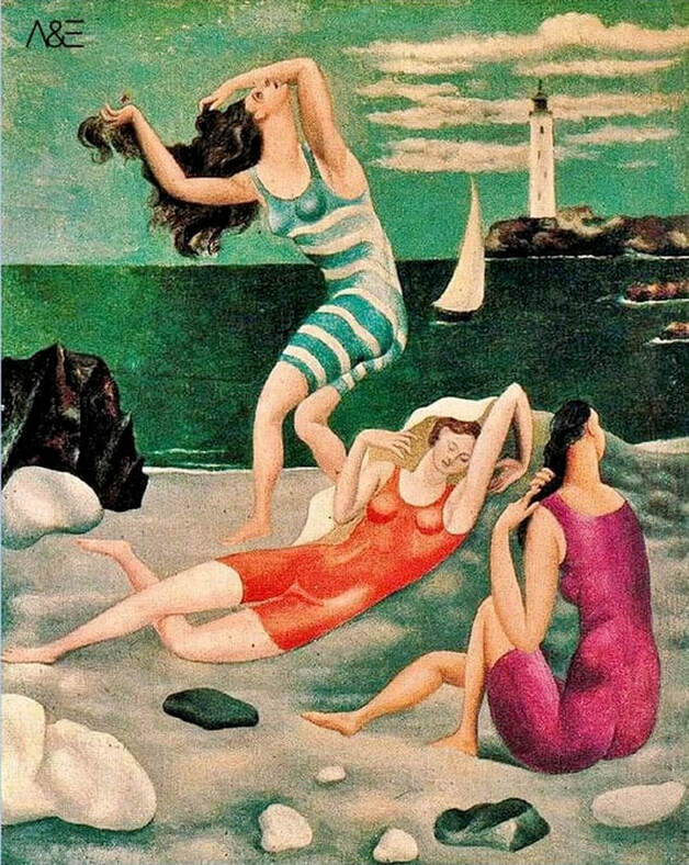
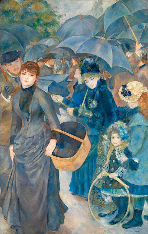
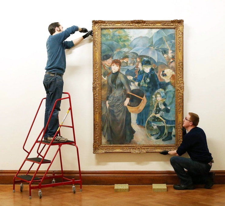
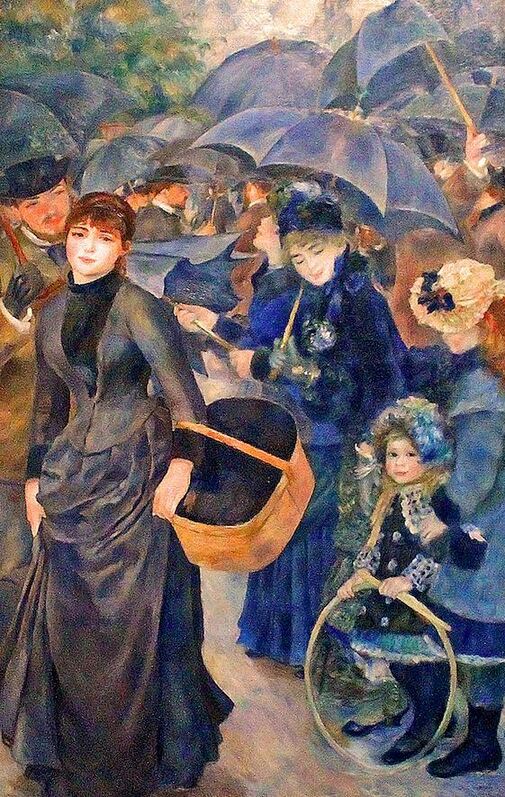
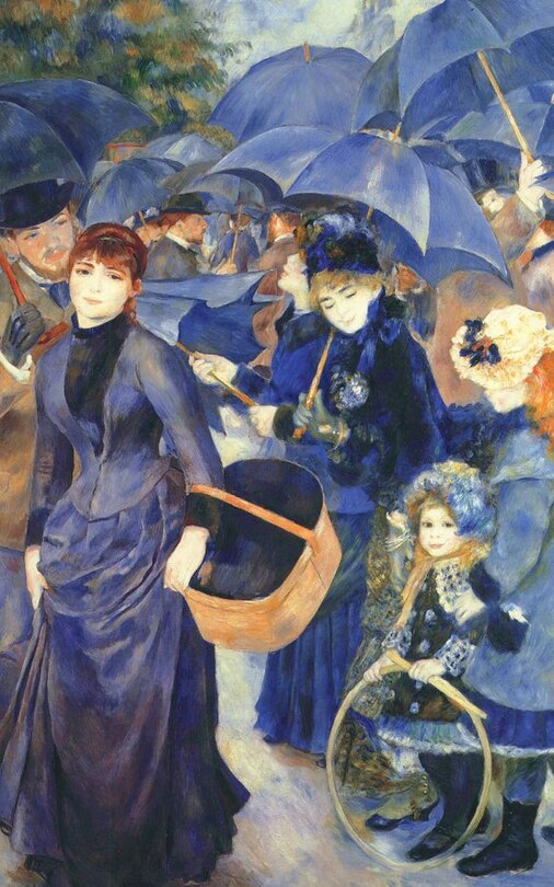
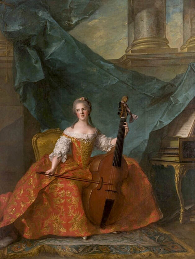
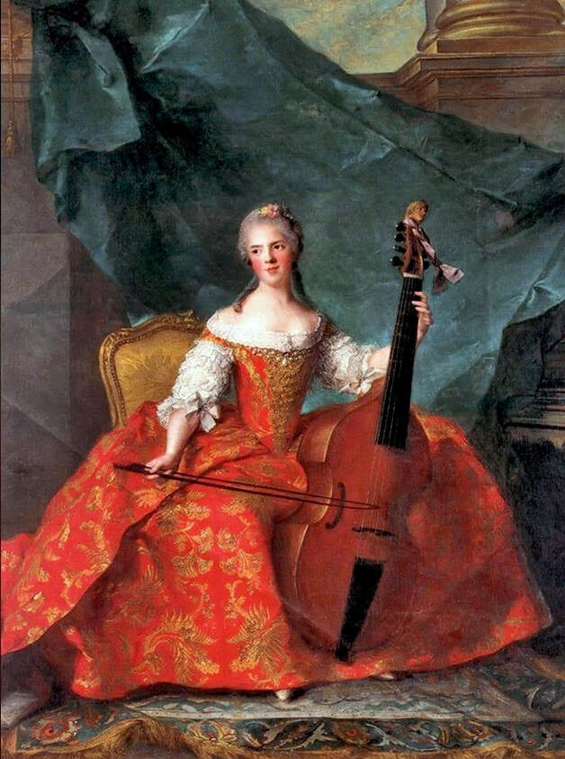
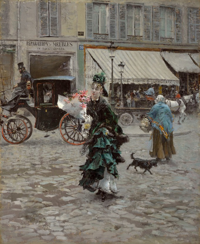
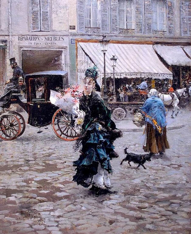
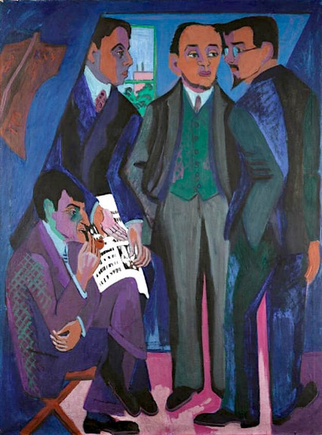
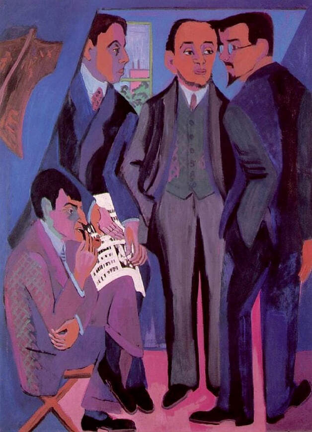
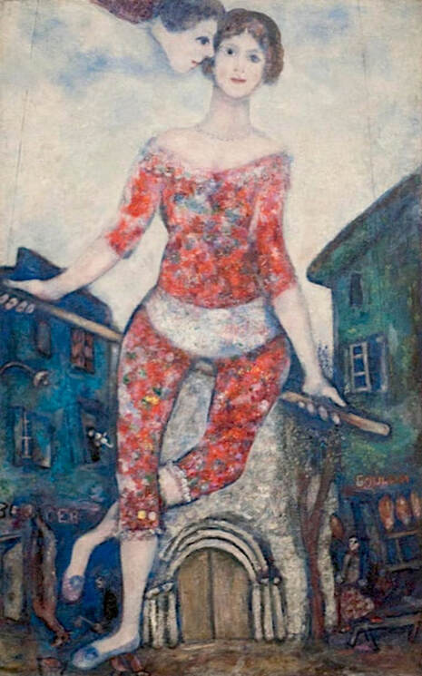
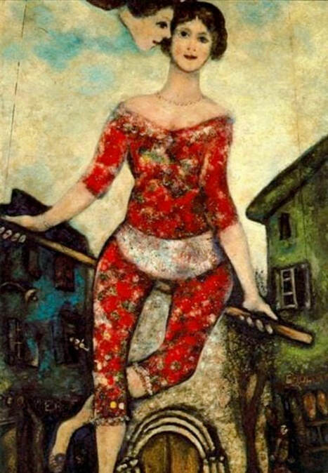
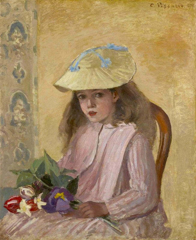
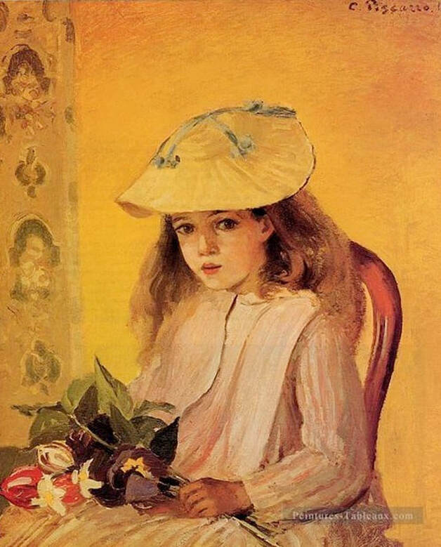
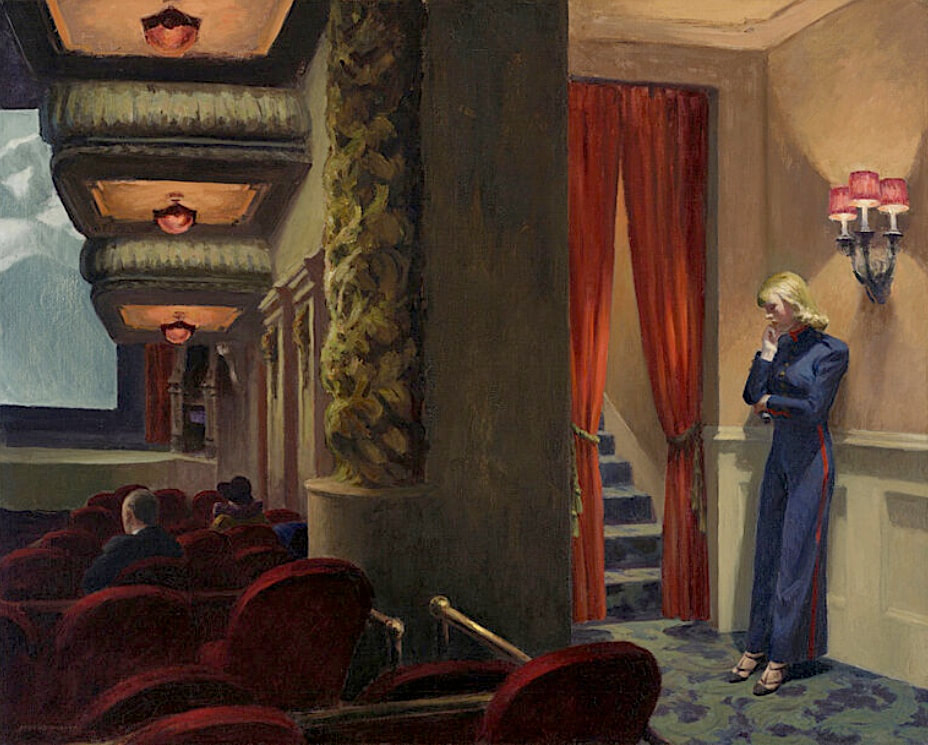
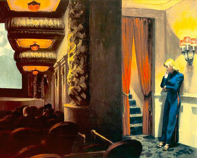
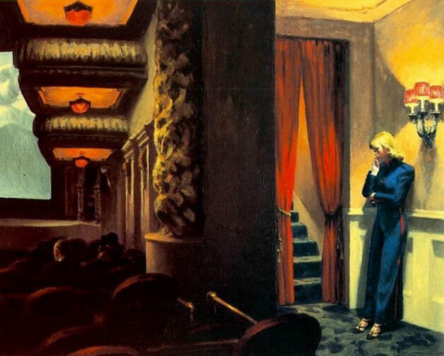
Henri de Toulouse-Lautrec, "At the Moulin Rouge: The Dance," c.1889-90; The Philadelphia Museum of Art. Paintings by Henri de Toulouse-Lautrec are often brightened up and "prettified" in reproductions, when, in fact, his intention was often the opposite, to portray both the active life and the sombre realities of the demimonde. Adding color and heightening contrast also tends to damage the work's sense of space and depth, obscuring rather than enhancing the contrast that the artist meant to achieve — between the figures in the foreground and the activity going on in the background. In addition, as shown in the artificially colorized reproduction below, excess contrast frequently blots out a lot of detail. Although an original Toulouse-Lautrec might be less colorful, in most cases it's probably more realistic, and certainly more in line with the artist's highly recognizable style. Pablo Picasso, The Bathers (Les Baigneuses), 1918; © Succession Picasso / RMN - Grand Palais (Musée National Picasso, Paris). Picasso's famous "Bathers" is seen above on display at the Musée National Picasso, Paris. The modern reproduction below has made extensive changes, including the falsely yellow and green coloration, and the heightened contrast, resulting in significant loss of detail. Also note the mark of the art vendor upper left — always an indication that the image might not offer a faithful representation of the original. It's helpful to remember that even abstract artwork will often retain natural colors in the sky, water, land, flesh tones, and so on. Artificial coloring frequently means that someone has tampered with the photo or created a new artwork that's only loosely based on the authentic work, freely altering the original elements to create a new, possibly more market-friendly, interpretation. Altered version of a painting by Pablo Picasso. Pierre-Auguste Renoir, "The Umbrellas," c.1881-86; © The National Gallery, London. Renoir's The Umbrellas at the National Gallery, London; Artnet, September 2019. This is a very popular Renoir, and hundreds of reproductions are available, many with the types of altered coloring seen in the images below. The first example has changed the blues, given the faces a slightly flushed look, turned the clouds pink, and obscured some of the detail. The second one has also misrepresented the blue tones, and the faces and clouds have gone a bit green. There's also a lot of blotchiness in places where there should be detail. Luckily, a first-hand photo is easily available at the National Gallery's website, and provides an excellent digital copy of the original. Altered version of a painting by Auguste Renoir. Altered version of a painting by Auguste Renoir. Jean-Marc Nattier, "Anne-Henriette of France, Known as Madame Henriette, Playing the Bass Viol, 1754; Chateau de Versailles. Traditional paintings from previous centuries are difficult to duplicate, due to the extensive and painstaking detail involved. Realism was very important to these artists, so their originals usually look very natural in terms of flesh tones, scenery, sky, clouds, interior woodwork, clothing, and so forth. If a person's skin doesn't seem life-like, or if other colors appear heightened or flattened out (all one color), the image is probably either a poor modern copy or a highly processed digital photo, as shown in the commonly shared image below. Note that the revised version also is missing some of the painting at the top and right side. The photo above is from the website of the Palace of Versailles, where Nattier's Madame Henriette is located. Altered detail of a painting by Jean-Marc Nattier. Giovanni Boldini, Crossing the Street, 1873/1875; The Clark Art Institute. This painting by Giovanni Boldini is beautifully detailed, with rich coloring, natural flesh tones and a true sense of depth, space, and the dynamic flow of real life. You can almost smell those flowers. The sketchy, blue-tinted version below — possibly an over-processed photo — has a thin, weak and blotchy appearance that fails to reach the heights of the original. Even so, it's seen frequently as a substitute for the genuine painting. The museum notes that the authentic work was dated twice by the artist, possibly indicating that he finished or reworked it two years after he began. Altered version of a painting by Giovanni Boldini. Ernst Ludwig Kirchner, Group of Artists (Painters of the Brücke), 1926; Ludwig Museum, Cologne. Photo: © Rheinisches Bildarchiv Köln. There's quite a difference in color tone between the authentic photo of this Kirchner painting and the altered version below, probably a modern reproduction. It looks as though someone has added a large dose of red to the palette, causing the faces to appear flushed, and everything else to become purple. Note the bright white newspaper, which has turned pink in the reproduction. Another clue: the central figure's outfit, which is green in the real-world painting, purple in the contemporary update. The photo above comes from Museum Ludwig's online catalog. Altered version of a painting by Ernst Ludwig Kirchner. Marc Chagall, The Acrobat, 1930; Marc Chagall Museum, Nice. There seems to be a trend these days toward "enhancing" artwork photos by adding a yellow cast and heightening the contrast. Photos do vary in quality, so in some cases, it might be useful to brighten a dark photo or add back a little color to a faded image. But efforts should be made to retain the original coloration and to intensify rather than obscure existing details. In the Chagall reproduction below, possibly a highly altered digital image, the deepened reds, yellow clouds, blotchy background, and brownish tint only detract from the emotion, dynamics and overall intention of the work. If you're interested, the museum has a short audio about the painting, which is called "L'Acrobat." The audio is available in several languages. Altered version of a painting by Marc Chagall. Camille Pissarro, Portrait of the Artist's Daughter, 1872; Yale University Art Gallery. This beautiful Pissarro — detailed and impressionistically naturalistic — has been turned bright yellow in the modern reproduction shown below, removing a lot of detail, obscuring the life-like elements of the portrait and in general adding new coloration without apparent reason. Sadly, yellowed images of famous paintings are common online. It's especially frustrating when a first-hand photo is easily available at a museum's website. Why the yellow? It remains a mystery. Note the watermark of the commercial art vendor on the altered image. It's hard to tell if the real-world reproduction looks exactly like this, or if the image has been further edited during its online history. The photo above comes directly from the Yale University website. Altered reproduction of a painting by Camille Pissarro. Edward Hopper, New York Movie, 1939; Whitney Museum of American Art. Edward Hopper's paintings are always naturalistic (although not necessarily hyper-realistic), with precise and thoughtful attention to light and shadow, foreground and background, details in even the least noticed places, and rich coloring overall. For example, notice the usherette's flesh tones in the Whitney's photo of New York Movie above. Hopper always manages to convey a sense of depth, space and actual life taking place within the frame. If an image that's supposedly of a Hopper work seems superficial, flat, uniform, lifeless or somewhat sketchy — as in the often seen, altered photos below — it would probably be best to look elsewhere for a more accurate copy. Altered version of a painting by Edward Hopper. Altered version of a painting by Edward Hopper. Corrections or suggestions?
|
REAL or REPRO?
A well-researched art resource that can help you find accurate images and spot altered copies. 100+ listings and growing daily. Browse at random, or search for something specific. Special requests are welcome.
Categories
All
Archives
January 2021
Disclaimer: This blog is intended for entertainment purposes only. Although every effort has been made to verify the accuracy of the information provided, the material included here should in no way be considered the final authority on any issues discussed in the text.
|

 RSS Feed