
|
Georges Braque, Landscape at La Ciotat, 1907; © Artists Rights Society (ARS), New York / ADAGP, Paris; Museum of Modern Art (MoMA), New York. 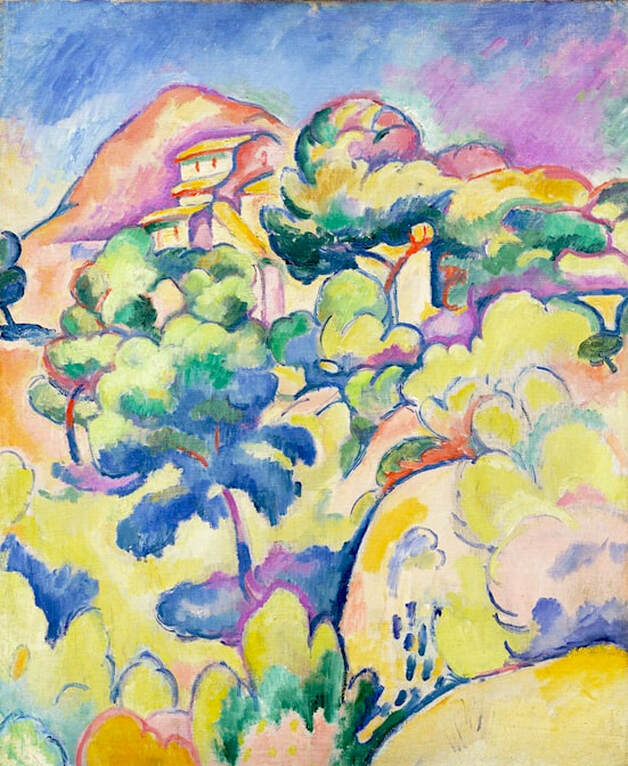 In this unusually reverse case, the oddly muted reproduction of this Braque painting looks darker and less colorful than the original. It's well known that early in his career, Braque identified with the Fauves and favored bright colors in his artwork. Landscape at La Ciotat, as seen above, is a good example. Unfortunately, the dark, brownish copy below is often seen instead, despite the fact that it barely looks like the same painting. Apart from completely altering the palette, the new version has taken the life out of the work, and obscured a lot of the interesting and lively detail. The museum notes: Before Braque met Pablo Picasso [...] he painted in the bright, bold colors shared by the Fauves. [...] They were given this name — meaning "wild beasts" — by an unsympathetic critic in 1905, as a result of the high-pitched colors and anti-naturalistic rendering they embraced. In the summer of 1907 Braque worked in the resort town of La Ciotat, near Marseilles, where he painted this landscape using heavy outlines, flattened space, and intense, harmonic colors. 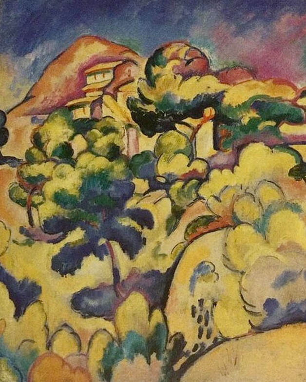 Altered version of a painting by Georges Braque.
0 Comments
Pierre-Auguste Renoir, The Garden in the Rue Cortot, Montmartre, 1876; Carnegie Museum of Art. 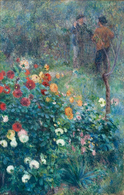 Although generally listed as a reproduction, the modern artwork below is only loosely based on Renoir's painting Garden in the Rue Cortot, Montmartre. The original, as seen above in the Carnegie Museum's photo, is tall in shape, and reflects Renoir's typical style, including the artist's trademark coloring, brushwork, subtlety, and depth of composition. The contemporary painting is shorter - but instead of cropping off the top and/or bottom to achieve the change, it has rearranged the composition entirely — crowding many of the elements of the original into a shorter frame. Together with the randomly enhanced coloring, the changes have produced an image that no longer looks like a Renoir. This is definitely an occasion for a so-called reproduction to be captioned more accurately as a new painting "inspired by" Renoir. 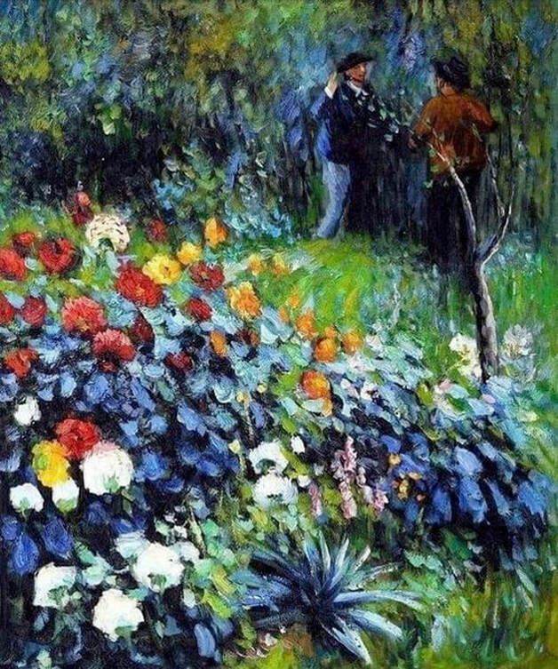 Modern artwork based loosely on a painting by Auguste Renoir. William Edward Fox (1872-1948), A Walk in the Park, nd; private collection. Photo ©Uppsala Auktionskammare, Sweden. 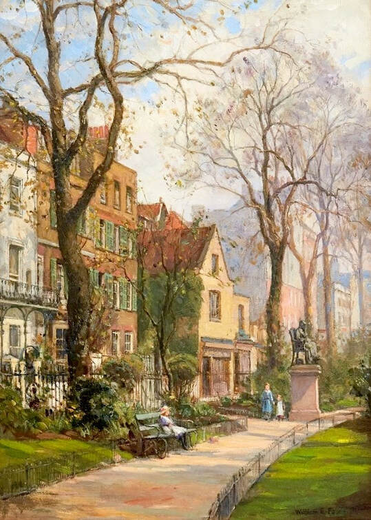 The image below is a good example of what can happen if someone over-edits a photo, especially one that's excellent to begin with and doesn't require any improvement. An amateur editor has heightened the sharpening and contrast without taking into consideration the way those changes would alter the naturalistic, very detailed and life-like qualities of the original. In fact, the updated version looks more like a drawing than an oil painting. There's also an unnatural, yellowish cast, and a section of the painting has been cropped off at the top. The photo above is from Uppsala Auktionskammare, Sweden, where the painting sold at auction in 2018. It took some time to track down an reliable image, so it's understandable that people online are using a more accessible, revised version instead. Still, it's preferable to see an image that's more faithful to the genuine painting, and more consistent with the artist's other work. 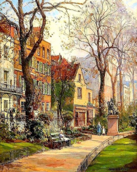 Altered version of a painting by William Edward Fox. Frederick McCubbin, Autumn Memories, 1899; National Gallery of Victoria.  This is a beautifully naturalistic painting by lesser-known artist Frederick McCubbin, and meticulously depicts the fading greenery, bare trees and near-wintry glow of the autumn sky and landscape. The extreme yellow glare of the altered version below should be a clue that it's been retouched digitally, but even so, this wrongly colorized image often is mistakenly shared as the real thing. The more accurate photo above is easily available at the website of the National Gallery of Victoria, where the authentic work is located.  Altered version of a painting by Frederick McCubbin. Paul Gauguin, Matamoe (Landscape With Peacocks), 1892; The Pushkin Museum, Moscow. 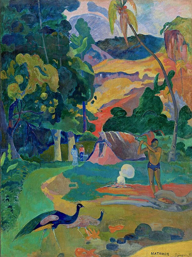 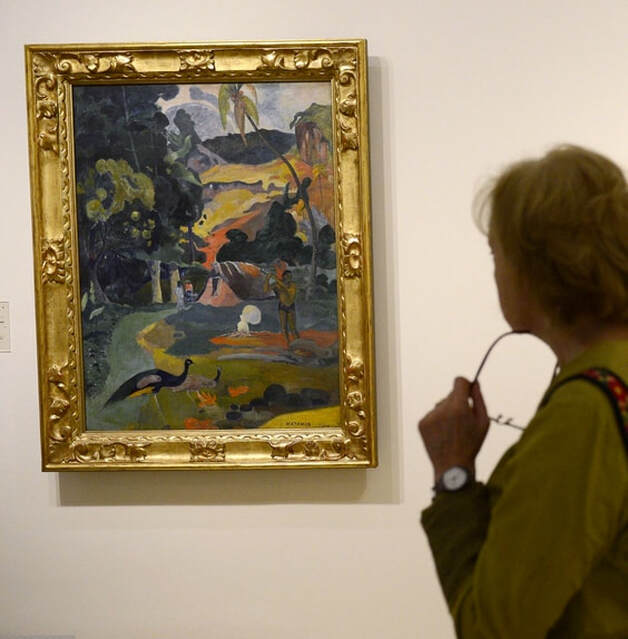 © Pierre-Philippe Marcou/AFP/Getty Images. Gauguin is known for his colorful Tahitian paintings, but unfortunately, enhanced reproductions like the one below usually detract from rather than improve images of his work. There's so much glare and excess photo editing here that the original lines, figures, flow of energy and overall appearance of the painting have been flattened into a nearly incomprehensible mélange. The museum's photo above comes closer to the authentic work, as shown by the photo of the painting on display at the Thyssen Bornemisza Museum, Madrid, in 2012 (Getty Images). Note that some experts question the title Matamoe (meaning death), suggesting that Gauguin might have intended to call the painting Matamua (loosely translated as Once Upon a Time), and instead made a simple spelling error. However, most believe that the title is a metaphor, referring to Gauguin's sense of being reborn during this fertile period in his career. 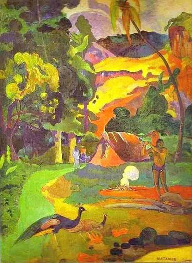 Altered version of a painting by Paul Gauguin. Claude Monet, Regatta at Sainte-Adresse, 1867; The Metropolitan Museum of Art, New York. 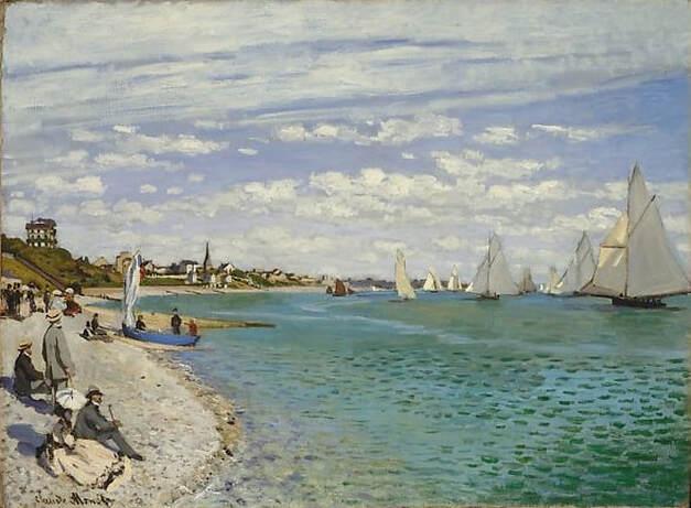 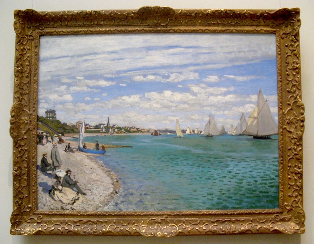 Look at the beautiful, naturalistic tones of this famous Monet painting. Billowy clouds, subtly variegated sea colors revealing the changing ocean depths, the shadows on the sand, and so on. The harshly altered reproduction below has turned everything a bit green, removed a lot of the detail, and added blotches where there should be greater substance and more clearly defined features. There's no need for it, either — an excellent photo is quickly available at the museum's site, and there are other accurate photos online in various locations. The photo of the painting on display was taken by a museum visitor in 2010. The Met also offers some background and insight into Monet's intentions with this painting: Monet spent the summer of 1867 at Sainte-Adresse, a well-to-do suburb of Le Havre on the Normandy Coast. On June 25, he reported that he had about twenty pictures under way, noting, 'Among the seascapes I am doing the regattas of Le Havre with many figures on the beach and the outer harbor covered with small sails.' This sunny regatta, watched at high tide by well-dressed bourgeois, seems to have been conceived as a pair with The Beach at Sainte-Adresse (Art Institute of Chicago), an overcast scene at low tide, showing fishing boats hauled onto the beach, peopled with sailors and workers. 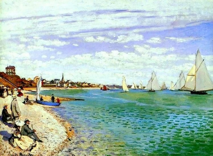 Altered version of a painting by Claude Monet. Katsushika Hokusai, Kirifuri Waterfall at Kurokami Mountain in Shimotsuke, c.1832; The Metropolitan Museum of Art, New York. 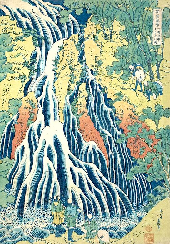 Katsushika Hokusai is probably best known for his world-famous work Great Wave Off Kanagawa, which is visually and stylistically similar to Kirifuri Waterfall, shown above, from the series A Tour of Waterfalls in Various Provinces. Since print artists often authorize many different prints — in varying colors and intensities — for a single composition, with other modern versions created later from the original blocks, it's often difficult to spot an imposter among the originals. However, in this case, the over-colorized, yellow version below stands out as an obvious departure from the many accurate depictions available online currently. 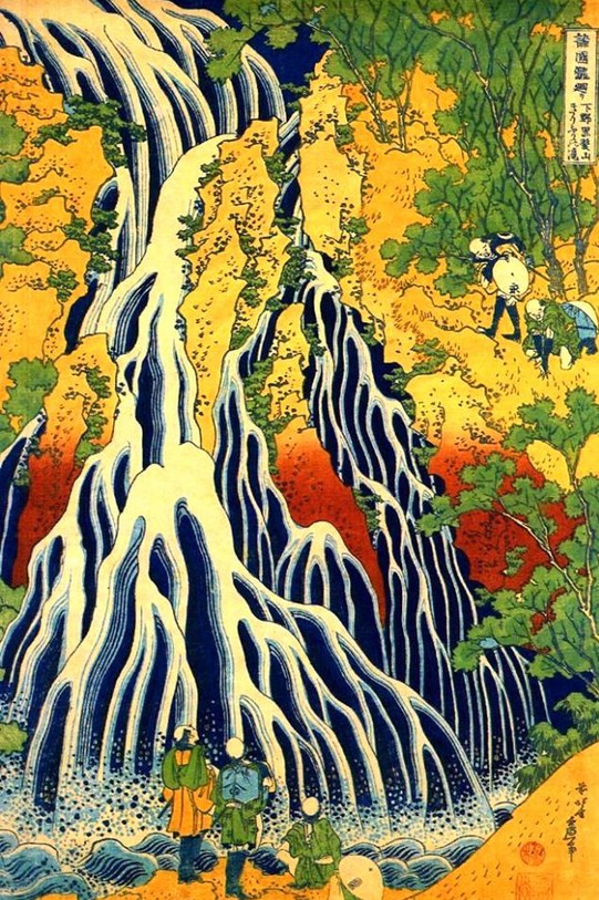 Modern, colorized version of a woodblock print by Katsushika Hokusai. Vincent van Gogh, Avenue of Poplars in Autumn, 1884; Van Gogh Museum, Amsterdam. 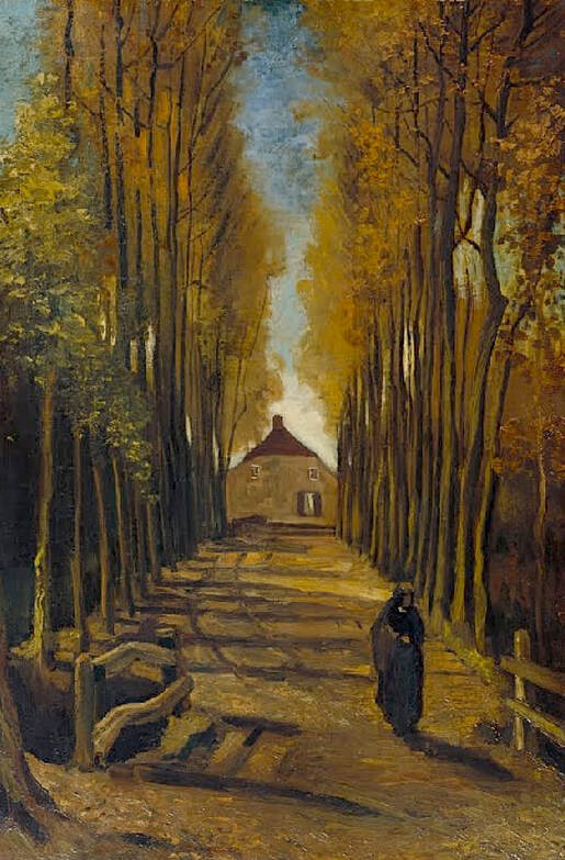 The altered image below appears to be a modern reproduction, with a lot of added orange. The original Avenue of Poplars in Autumn is more natural in appearance, with a darker, low-key feel, perhaps more representative of a Van Gogh autumn. The modern version brightens everything up, not necessarily the artist's intention. 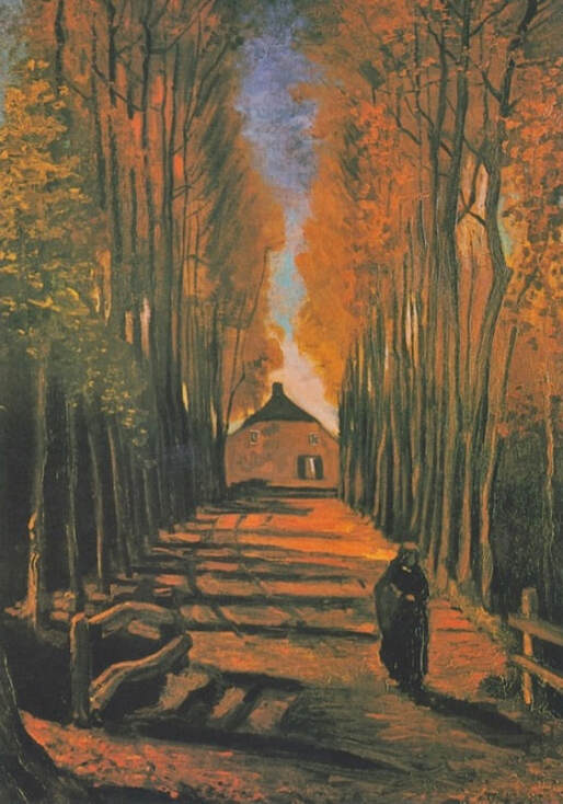 Altered version of a painting by Vincent van Gogh. Daniel Garber, Shadows, 1922; private collection. Photo © Freeman's Auctions. 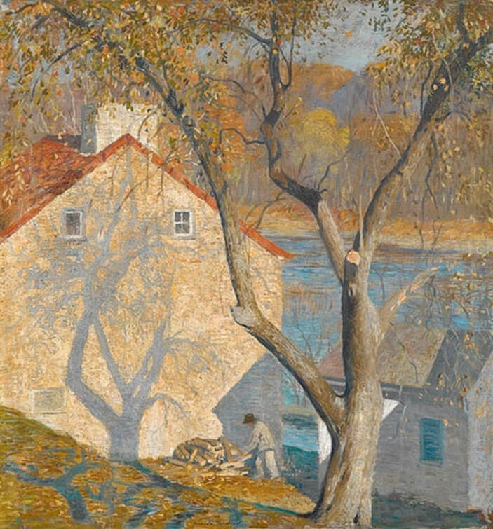 One of Daniel Garber's greatest assets was his ability to manipulate shadow and light, and to communicate in an almost visceral way the feel of the outdoors, the weather, the seasons, and the effect of the air itself on the figures and objects in his paintings. Shadows is a wonderful example, The image above is from Freeman's Auctions, where the painting sold in June 2015 for $209,000. Clearly, the modern reproduction shown below has entirely missed the point of the work, and has introduced radical colors that have nothing to do with the artist's original intentions. Furthermore, the high contrast and flat coloring reduce the depth, space and lifelike atmosphere seen in the authentic painting. 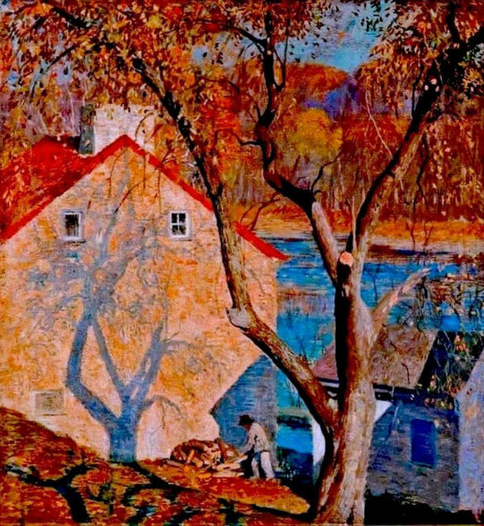 Highly altered version of a painting by Daniel Garber. Odilon Redon (1840-1916), The Road to Peyrelebade, [nd]; © RMN-Grand Palais (Musée d'Orsay) / Christian Jean. 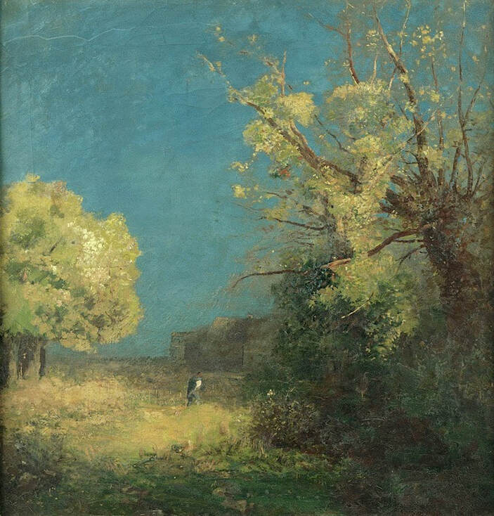 This beautiful Redon painting is definitely misrepresented by the altered version below. The modern copy, probably an overly edited digital image, has introduced a lot of artificial color, along with excessive contrast that has blotted out much of the original detail. Natural scenes of this period usually retain some aspects of real life — including natural hues, earth tones, greenery, and so on — even if the composition is somewhat abstract. Dark blotches and false colors are good indications that the image might not be entirely accurate. 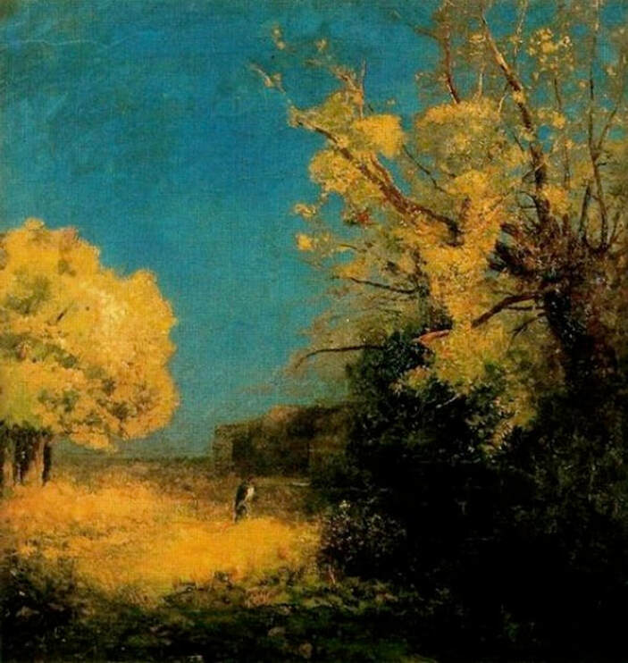 Altered version of a painting by Odilon Redon.  THE ART DETECTIVE Bloopers, Fakes & Mistakes
|
REAL or REPRO?
A well-researched art resource that can help you find accurate images and spot altered copies. 100+ listings and growing daily. Browse at random, or search for something specific. Special requests are welcome.
Categories
All
Archives
January 2021
Disclaimer: This blog is intended for entertainment purposes only. Although every effort has been made to verify the accuracy of the information provided, the material included here should in no way be considered the final authority on any issues discussed in the text.
|
 RSS Feed