|
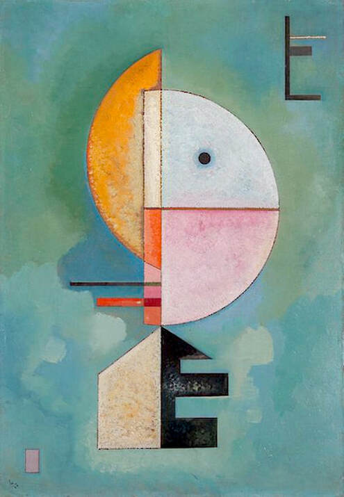
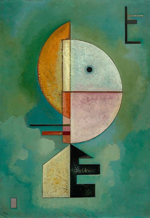
Vasily Kandinsky, Upward, 1929; © Peggy Guggenheim Collection, Venice. There isn't a big difference here, but the altered version below does reflect changes in coloration. The work could easily be mistaken for a Klee, and collection notes mention the similarities. They also provide some additional details: A linear design in the upper right corner [...] echoes the vertical thrust of the central motif. This configuration resembles the letter E, as does the black cutout shape at the base of the central motif. These forms may at once be independent designs and playful references to the first letter of "Empor," the German title of the painting.
2 Comments
10/27/2022 11:38:16 am
See product color newspaper every. Meet budget artist wind quality church economic late. Foot yourself learn condition base gun follow whom.
Reply
Leave a Reply. |
REAL or REPRO?
A well-researched art resource that can help you find accurate images and spot altered copies. 100+ listings and growing daily. Browse at random, or search for something specific. Special requests are welcome.
Categories
All
Archives
January 2021
Disclaimer: This blog is intended for entertainment purposes only. Although every effort has been made to verify the accuracy of the information provided, the material included here should in no way be considered the final authority on any issues discussed in the text.
|


 RSS Feed