
|
Claude Monet, Antibes Seen From La Salis, 1888; Toledo Museum of Art. 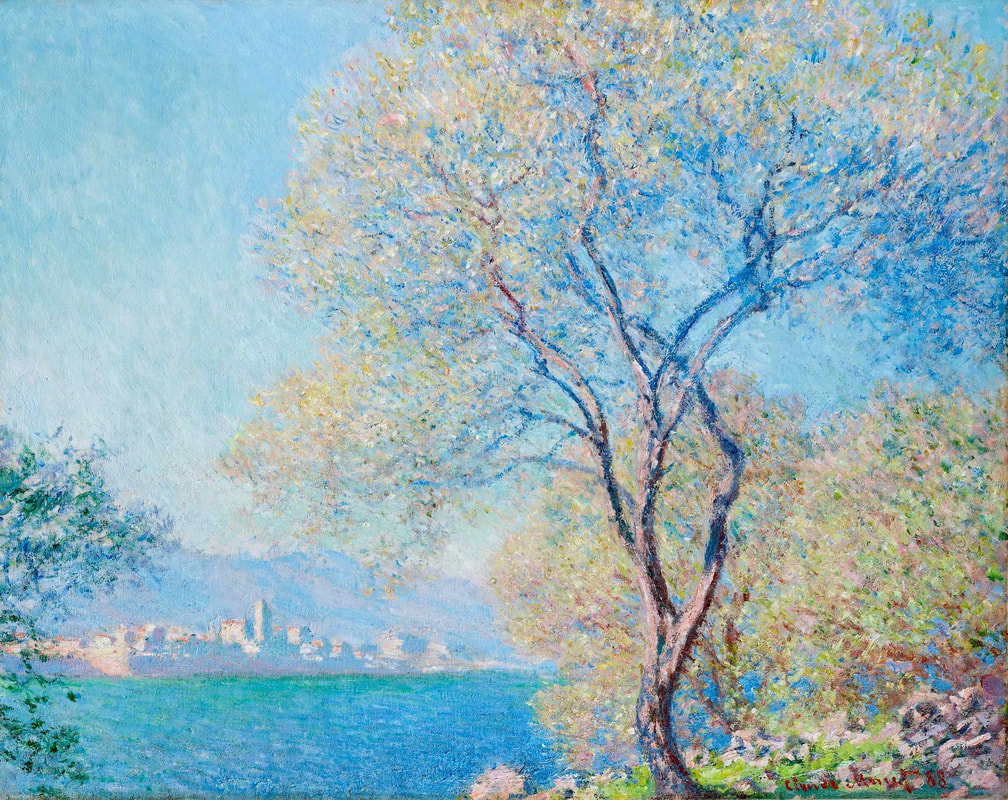 The original Monet painting, shown above in a photo from the Toledo Museum of Art, is spectacular, with Monet's signature blues, and plays of light that were so difficult for him at the time: "I'm wrestling with the sun. And what a sun it is!" According to the museum, "His efforts to express the light and color of the Mediterranean fulfilled a promise to his companion, Alice Hoschedé, that what he would paint in Antibes would be 'sweetness itself, white, pink, blue, all of it enveloped in this fairy-tale-like air.'" Clearly, the dark and yellowish reproduction below doesn't come close to achieving these effects. And Monet's words help to confirm the relative accuracy of the museum's photo. 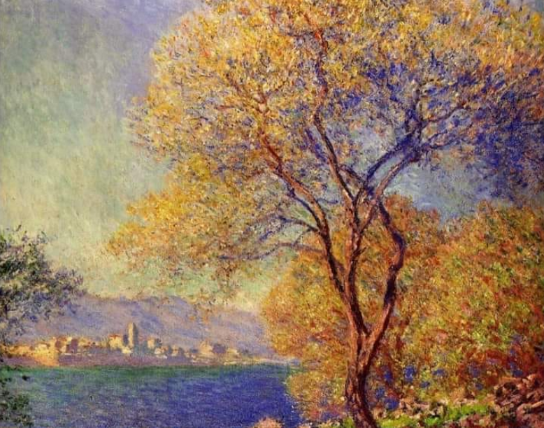 Modern artwork based on a painting by Claude Monet.  Copywriting & Consultations
1 Comment
Paul Cézanne, The Card Players, c.1892-96; The Courtauld Institute, London. 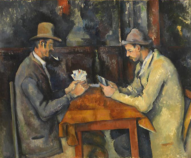 First of all, there are two of these! They're both authentic and at first glance appear identical. However, a closer inspection reveals small differences. The one below is at the Musée d'Orsay. Look at the cards in the players' hands in each painting. In the Courtauld painting, there seem to be more cards, more well defined. In the Orsay painting, the wine bottle on the table is clearly outlined, whereas in the Courtauld work, the bottle is in shadow. Other small details allow us to tell the two works apart. Note that the Courtauld's painting was featured in a well-received exhibition there in 2011. 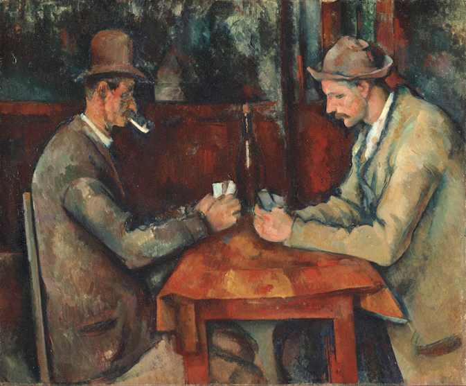 Paul Cézanne, The Card Players, c.1890-95; ©Musée d'Orsay, Paris. It's possible that many art lovers and art vendors aren't aware of the two different paintings, and are therefore doubly confused by versions they see online, whether accurate or altered. In fact, that might explain why the reproduction below — apart from the extensive changes in coloring — appears to have merged the two works. For example, the wine bottle in the recent update is darker than it is in the Orsay painting, but more well defined than we see at the Courtauld. The bottom of the painting seems to have been cropped out, also. In addition, many objects on the shelf behind the players seem to have disappeared, and there are some additional items and details in the background that don't appear in either of the originals. 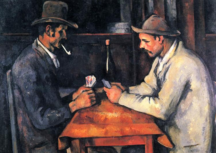 Modern artwork based on two Cézanne paintings known as "The Card Players."  Corrections or suggestions?
Pierre-Auguste Renoir, Standing Bather, c.1885; The Clark Institute. 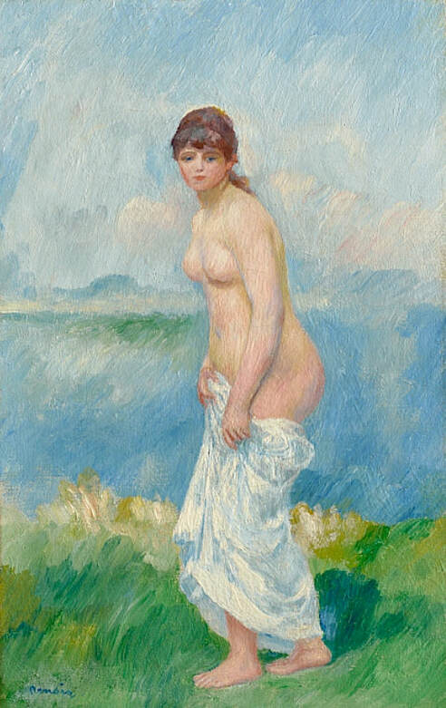 This is one of several paintings and drawings by Renoir called "Standing Bather," many of which are similar in composition and execution. The purple version of this painting, seen below, has appeared regularly online. It's clearly a newly-minted interpretation with an imaginative color scheme. I don't know much about the origin of the contemporary copy, but the museum's photo is definitely the better choice. 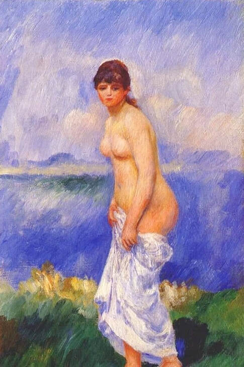 Altered version of a painting by Renoir. Joan Miró, Hirondelle Amour (Love Swallow), 1933-34; Museum of Modern Art (MoMA), New York. 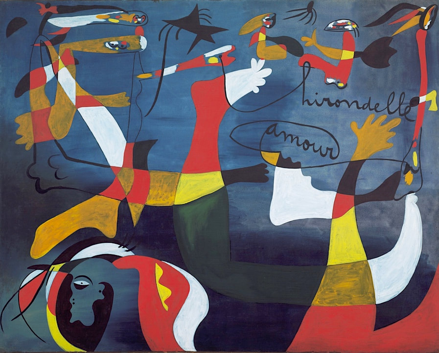 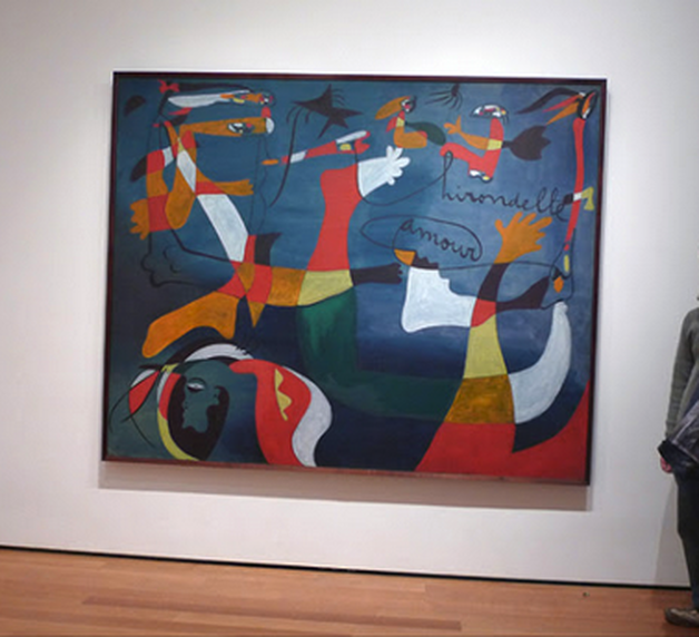 This Miró painting has a long history, and in a 1959 press release announcing "the most complete one-man show ever assembled of paintings by [Miró]," the Museum of Modern Art (MoMA), New York, called it "one of the most successful pictures of the 30s." In addition to the museum's online listing, there are several photographs available of the painting on display. The one shown here is from a traveler's 2008 blog post, and gives us a sense of its large size. The mid-century MoMA press release also mentions that the painting "was originally conceived as a cartoon for a tapestry. Hirondelle means swallow and the swooping darting forms suggest a swallow's flight." The first image below is a greenish version that has appeared online lately, possibly a digitally altered photo. The final photo shows a modern reproduction from a Wiki site, where we're told prints are available for sale. 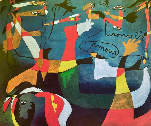 Altered version of a painting by Joan Miró. 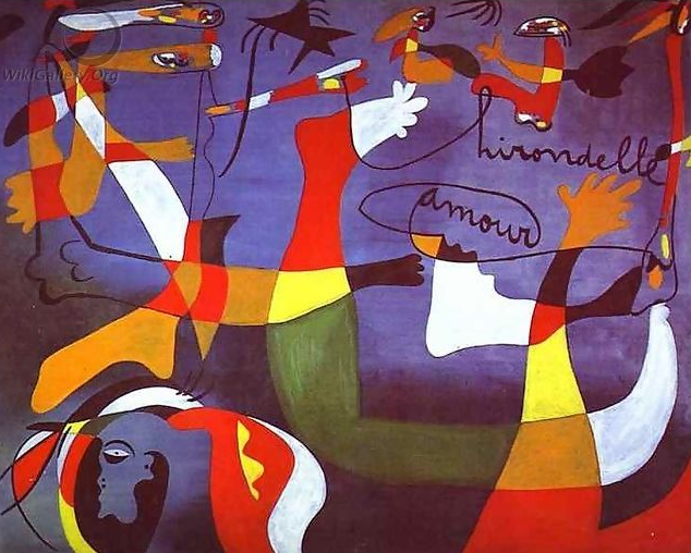 Modern artwork based on a painting by Joan Miró.  THE ART DETECTIVE Bloopers, Fakes & Mistakes
Daniel Garber, In New Hope, 1930; ©Estate of Daniel Garber; Philadelphia Museum of Art.  The altered image below is probably a manipulated photo rather than a modern reproduction, although it could be a photo of a recent painting. In either case, the entire painting has been colored yellow for some reason, with extra contrast, both of which obscure the depth, variation and detail of the original. The museum's photo gives us a sense of a natural scene, with a clear sense of what the area looks like at that time of year. You can almost feel the crisp weather. The yellow version is just a flat townscape without emotion or sensation.  Altered version of a painting by Daniel Garber.  Copywriting & Consultations
Jules-Élie Delaunay, Ophelia, 1882; Musée des Beaux-Arts de Bordeaux. 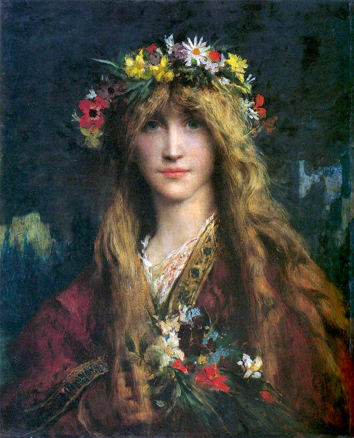 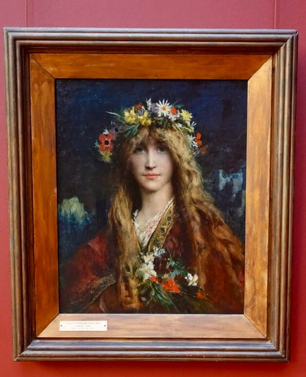 Accurate images of this painting by Jules-Elie Delaunay are hard to find. As a result, altered copies like the one seen below are fairly popular. Luckily, there have been many visitors to the Musée des Beaux-Arts de Bordeaux, and some of those people have posted their photos. The picture of the painting in its frame comes from a 2017 article about the museum's exhibits. Although the overly yellow look of the modern version, along with its high glare and excess contrast, should provide clues that the image might not look like the original, art lovers continue to share it regularly. 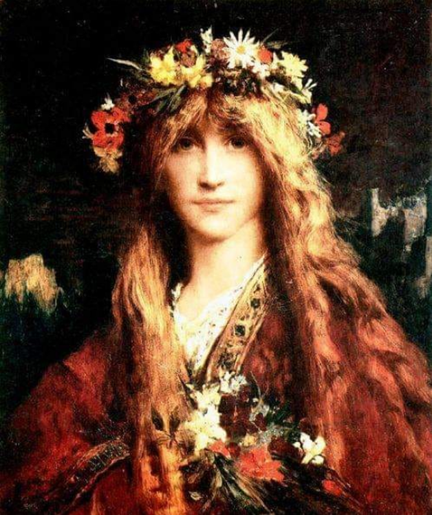 Altered version of a painting by Jules-Élie Delaunay.  Corrections or suggestions?
Wassily Kandinsky, Composition X (Composition 10), 1939; Kunstsammlung Nordrhein-Westfalen. 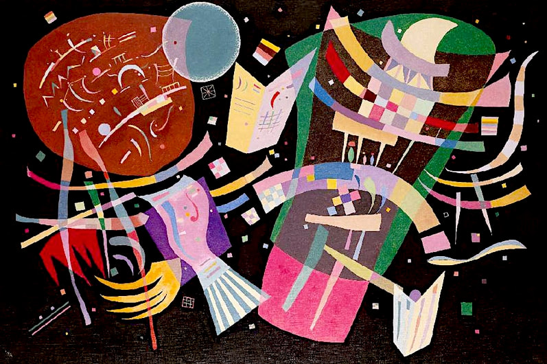 Composition 10 is the final entry in Kandinsky's colorful, innovative, and dynamic Composition series. The modern version below, seen circulating recently, is probably a modern reproduction. The colors are altered throughout, and to some extent have become less varied, with reduced contrast and intensity. For example, note the circle at the top, blue in the original photo, green in the recent update. A separate post looks at Kandinsky, Composition VII. 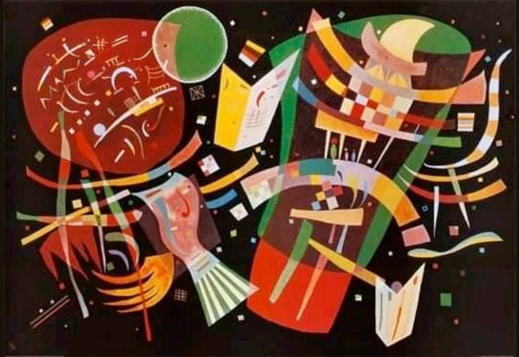 Altered version of a painting by Wassily Kandinsky. ART LOOK MODERN Édouard Vuillard, At the Board Game, 1902; Städel Museum, Frankfurt.  The dark, blue-tinged version below is probably a reproduction of this Vuillard painting, possibly further altered with an editing app. It's best to avoid low-res images in general, since they can't adequately represent the artwork being shown, but keep in mind that blurry photos might also indicate a false image. Some fuzzy photos are authentic, but if so, they're often from sites that don't permit large-size downloads due to copyright restrictions. When that happens, there should be (but usually isn't) a copyright notification.  Low-resolution, altered version of a painting by Edouard Vuillard.  Copywriting & Consultations
Claude Monet, The Bridge at Bougival," 1869; Currier Museum of Art. 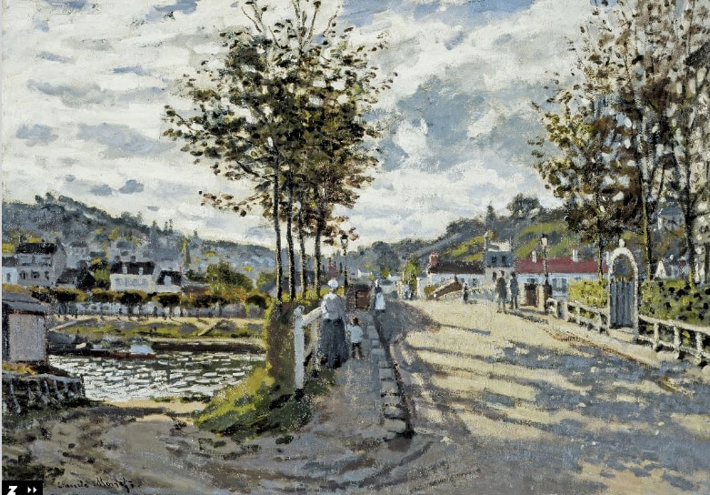  It's always a shame when a beautiful work of art is randomly altered, but in this case it's particularly unfortunate, since Bridge at Bougival is one of Monet's most significant paintings. An article in the Concord Monitor about the painting's return to the Currier after a year on tour, passes along information from Andrew Spahr, the museum's director of collections and exhibitions: The true importance of [the painting] has only been revealed in the last several decades [...] Scholars now recognize [it] as a turning point in Monet's early career, in which he begins to form a new style that would transform not only his working method, but the whole of western art. The article goes on to say that art historian and Monet expert Paul Hayes Tucker, "calls the painting 'one of the great pictures,' and a real mark of Monet's achievement at that moment." The purple version below is probably an altered photo of a modern reproduction. Why change the colors or tamper with the overall look of the painting? A good photo of the original is easily accessible at the museum's website. 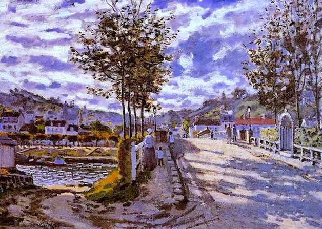 Altered version of a painting by Claude Monet.  THE ART DETECTIVE Bloopers, Fakes & Mistakes
Roger Fry, Virginia Woolf, c.1911-12. 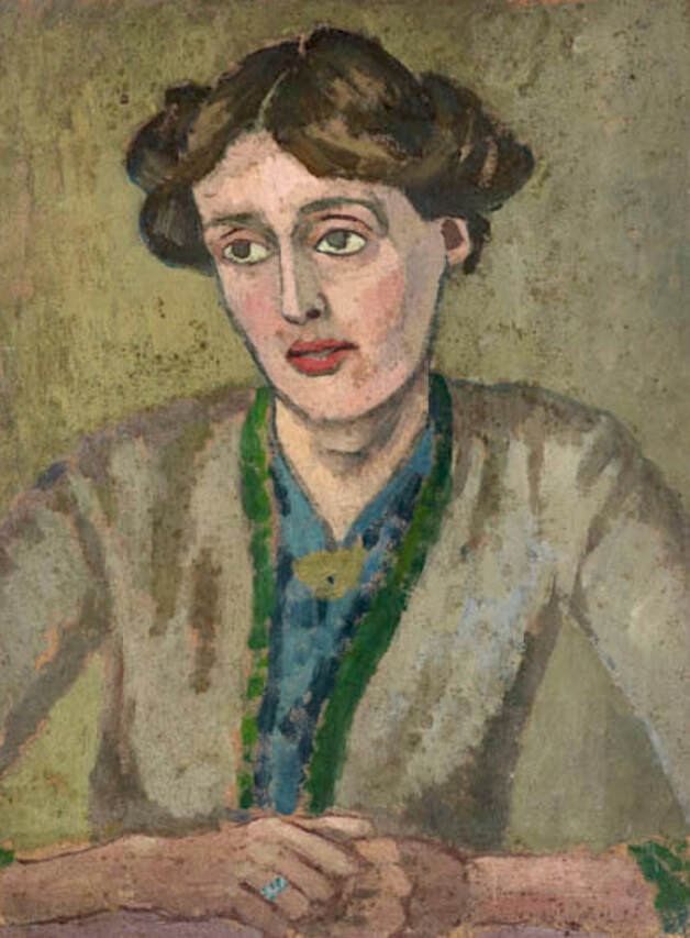 The authentic image above comes from a 2014 article in Country Life magazine about an exhibit at the National Gallery, London. The exhibit, which featured works inspired by Virginia Woolf, was very popular at the time, and attracted a lot of public interest and press coverage. Most copies of the painting are fairly close to the original, but some take more liberties than others, as in the example below. The updated version is overly blue, which could be the result of a photo edit, but also might also indicate that it's a recently painted reproduction. 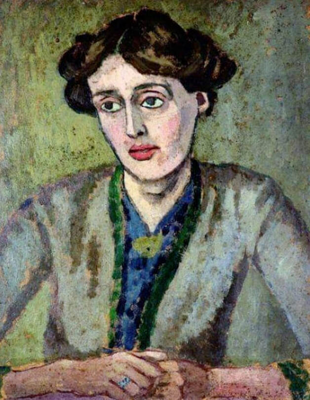 Altered version of a painting by Roger Fry. As a side note, the painting shown below, by Woolf's sister, artist Vanessa Bell, also appeared in the National Gallery exhibit. It looks oddly similar to the Fry painting, and was painted around the same time; in fact, Woolf seems to be wearing the same outfit. So far, I personally haven't seen any evidence of someone confusing the two works, but a mix-up certainly is possible. The photo comes from an article in the Independent about the Virigina Woolf exhibit. 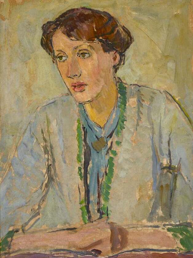 Vanessa Bell, Virginia Woolf, c.1912; ©Estate of Vanessa Bell, Courtesy Henrietta Garnett.  Corrections or suggestions?
|
REAL or REPRO?
A well-researched art resource that can help you find accurate images and spot altered copies. 100+ listings and growing daily. Browse at random, or search for something specific. Special requests are welcome.
Categories
All
Archives
January 2021
Disclaimer: This blog is intended for entertainment purposes only. Although every effort has been made to verify the accuracy of the information provided, the material included here should in no way be considered the final authority on any issues discussed in the text.
|
 RSS Feed